
..........................................................................................................................................................................................................
just my type

the lady who lives next door to our office subsequently lives next door to her daughter and son-in-law, both of whom follow the unrwitten law of hebridean housing and have their abodes coloured traditional white. apart from the odd green or pink exception, that's pretty much how most traditional houses are delineated not only across islay, but most of the islands further north.

a perceptible downside to this fact is that the weather experienced across the western isles is rarely content to leave such pristine colour well alone, meaning a regular programme of repainting. this usually takes place in the summer months when there's a better chance of being able to carry out the process without teaming rain washing it all across bowmore main street. this past summer, that is exactly what our neighbour's son-in-law completed in our unfathomably sunny and mostly warm weather.
an additional custom around these parts (and elsewhere for all i know), is the offering of some smartass remark on the passing, to anyone who appears to be involved in some form of necessary domestic duty. in this case, said gentleman traipsing up the street clad in a paint spattered boiler suit carrying brush and paint.
at this point it is necessary to digress just a tad and explain to the uninitiated the insidiousness of the football obsession throughout almost every region of scotland, even allowing for our geographic estrangement from any notable scottish teams. from the time of my youth at school, the two principal soccer adversaries both on and off the field have been glasgow rangers (blue) and glasgow celtic (green). supporters of the former would avoid having grass in their garden if they could possibly manage it.
so at the point of my meeting the rangers supporting painter approaching the all but wholly decorated establishment, i thought it a humorous diversion to mention that i had spoken to his mother-in-law and she'd mentioned that, instead of white, perhaps green would be a pleasant alternative. his riposte? "there'll be no f***in' green on this street." due to the predominance of rangers supporters on the island, i think this a reply that would find much favour in the principality.
i have, as someone for whom colour plays a major part in the daily employ, never fully understood this transference of vitriol, however light-hearted in intent, from a specific subject to an innocent colour. arguably, it has its origins in the red means stop, and green means go that we all learn as youngsters. on a designated day, the significance of which i'm sure few if any understood, even at primary school, the blues were the polar opposite of green.
some colour choices are not open to argument, and nor can their definition be arbitrarily altered.
but thankfully, such strictures do not apply to all walks (or pedals) of life. in certain circumstances, a sense of design is allowed to prevail even when that change flies in the face of perceived tradition. that last word, 'tradition' is the one mostly responsible for resistance to change, as if quoting it in one's manifesto absolves any onus to look outside the box (so to speak). however, not all are weighed down by such notions, willing not only to explore pastures new, but even to pass the baton to a trusted third party.
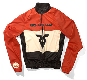
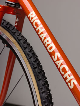
warwick, massachusetts framebuilder, richard sachs, has offered thousands of frames across the years clothed in quality red and white paint by master painter, joe bell. this selfsame colour scheme has decorated the bicycles and clothing that form the basis of the richard sachs cyclocross team. originating from years past when his clothing supplier had "already committed kits to the riders. the fabric was red, and i chose the colour for the team bicycles because it made sense. all these (30) years, the bicycle have remained red."
however, as recently testified to on his website, richard opted to break with both tradition and the thirty year-old red. in other words, a makeover. richard's job is, amongst others, to build the frames, perform duties as general factotum for his cyclocross team and race for all he is worth. in this case at least, design and appearance wasn't on the list. that job was gratefully handed over to rich roat and his colleagues at house industries a digital foundry based in yorklyn, delaware. (house industries have been a co-sponsor of the richard sachs cyclocross team for several years.)
whose idea was the redesign; richard's or house industries'? "About 22 months ago I asked Rich Roat and House Industries to take a look at my identity program, deconstruct it, and create something for me with what was left."

more often than not, re-designs applicable to bicycle racing teams are as a result of a change in sponsor or possibly even bicycle supplier. neither was the case for the richard sachs cyclocross team, who must buck the itinerant trend in cycle sport by having retained the same sponsorship portfolio for many a successful year. sachs elicits such loyalty. but tradition often has a tenacious grasp upon the day to day, so did richard leave it all up to house, or were there certain no go areas?
"No. I basically gave them the keys to the car and said, "Here, you drive this thing.""
i truthfully have no idea if there are consultants inhabiting the bicycle industry, ready and willing to provide design expertise to any existing or prospective cycle racing team. the reality may well be more rudimentary than that. but though house industries have been happy to continue a mutually beneficial relationship with the team, it seems something of a stretch to extend that to effectively altering the way everything is perceived from this point onwards. how does a font provider approach the process of redesigning all aspects of a bicycle race team?
"First of all, we started twenty years ago as a design company and have always tried to let good design drive any project we work on. We introduced the fonts early on as a way to supplement and support our design habit, and the two disciplines have played off of each other ever since."
so is this something that eveloved as it progressed, or were the ideas cut and dried more or less from day one? "Like any House Industries venture, the Richard Sachs project grew and evolved as we dug deeper. It started as a redraw/rework of the downtube logo and gradually creeped into us redesigning the team kit and anything else we could get our hands on as we gained more appreciation for and attachment to the Richard Sachs oeuvre."
there are any number of reasons as to why commerciality would wish to sponsor a bicycle race team. an expanding of awareness, expanding of geographical boundaries, or something even as crassly simple as being a cheaper form of advertising than offered by any alternative project. or, as is apparently the case with that of house industries and richard sachs, a symbiosis external to any real commercial objectives on behalf of either party. as house chief rich roat mentioned in an interview with twmp a couple of years ago "I thought that there was a certain correlation with his manifesto and our sometimes quirky 'business' model."

but in the case under discussion, how does roat see it all relating to his partnership with richard sachs and house industries' principal concerns? "Our core business has always been doing good work with good people, then promoting the work in a way that helps sustain our business. Our relationship with Richard is based on the currency of mutual respect and we hope to keep building on what we've done together indefinitely. Or at least until Richard gets tired of us sweating him to let us restyle things."
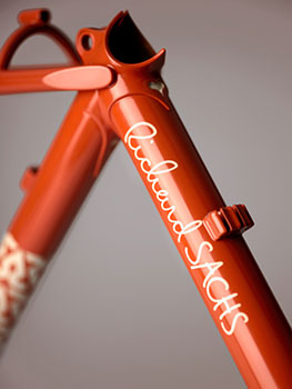
the new team kit, redrawn sachs top tube signature, neutraface no.2 titling font on the downtube and saffron paint scheme present a modern, yet subtle change from the traditional red and white. from a personal point of view, i'd venture to welcome it as an unqualified success, and i have already placed my order for a long-sleeve jacket, cap and rs socks. though i do not possess a richard sachs bicycle (one day, perhaps), i'd really quite like some of the style to rub off on yours truly.

however, richard's non-attachment to the vestiges of tradition might concevably be at odds with those of his customers. with a multi-year waiting list, it's just possible that some of those with their names in the book might not share his saffron enlightenment, having harboured a long-held desire for red and white. can those with a frame on order stick with the 'old' colours if they wish?
"No.
"And this is not a new thing at all. I have had quite a few art file revisions through years. Decal scales change. Ink colors get bolder or more opaque. The frame reliefs get trimmed with different shades of paint. Font borderline weights have evolved. Even the reds and whites we have used all along since 1981 have had more variations than I can remember.
"When any single line in the sand was crossed, we never went back to what came earlier. It's no different this time. The graphic details that House Industries created for me are now the default art that comes on my bicycles. And the red and white scheme that so many are familiar with is now part of my past."
the first official outing in new garb took place this past weekend at the catamount grand prix in williston, vermont.
richard sachs cyclocross team | richard sachs | house industries
wednesday 16th september 2013