
..........................................................................................................................................................................................................
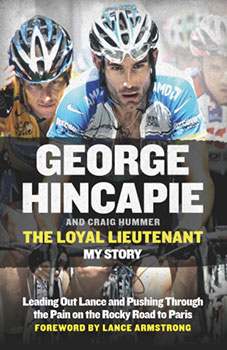
the loyal lieutenant; my story. george hincapie and craig hummer. harper sport hardback 300pp illus. £20
my day to day travails concern what used to be referred to as desktop publishing, a particular vocation enabled by the fine folks at aldus in the early 1980s, having brought to market their groundbreaking pagemaker programme for the fledgling apple macintosh computer. nowadays i believe the same occupation is more commonly known as page layout, though that might just be me. the software too, has moved onwards, with pagemaker having now gone to the great binary heaven in the sky, replaced by the ubiquitous indesign from aldus' successors adobe.
it's a job i rather enjoy, something that can be noted from the enthusiasm with which i undertake extra-curricular research to advance my abilities beyond the specific demands of my job. these have brought me into contact with both photoshop and illustrator, both from the previously noted adobe. rather than simply stick a few words and pictures on a page, i have looked into the variations and suitability of different typefaces, both serif and sans-serif, whether they offer italics, small caps, ligatures, alternatives, to the tracking and kerning and default leading features.
hopefully it is only me who fusses over such idiosyncracies, for i generally believe that only the message should leave an imprint; the messenger ought to remain transparent. it is commonly known within typographic circles, that line length has great bearing upon legibility. too long and the reader's eye falls to the line below; too short, and reading becomes harder than it need be. additionally, in an ideal world, as in these black and yellow pixels, all type would be set justified left and ragged right, but due to space considerations, our local newspaper fully justifies all text. not ideal, but needs must.
however, i must temper some of my following conclusions in the light of this coming from one who completely eschews the use of uppercase letters. (just before anyone gets in there first).
whoever undertook to mastermind the typesetting of george hincapie's book the loyal lieutenant is clearly either wholly unaware of these determined conventions, or just like david carson in his much celebrated, but now defunct magazine raygun, has chosen to ignore them altogether.
this should be a book review concerning just how george hincapie managed to justify use of banned substances and practices during his professional cycling career. it ought also to shed light on quite why anyone would ask the pariah of the sport (lance armstrong) to write the foreword for said volume. but sadly, that is not the case.
i confess to having admired big george during his career, probably because he was not only unafraid of paris-roubaix, but actively engaged in trying to win the darned race on more than one occasion. my complete naivety in the ways of blood doping and subsequent acceptance at face value even of victories that seemed too good to be true, does me no favours now. in common with many other fans of the beautiful sport, i now feel like an embarrassed fool, less than well disposed towards those who now seem intent on cashing in on not only our foolishness, but a subsequent kiss and tell culture. for them it must seem like a win/win situation.
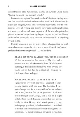
however, it is not those matters that have prevented my offering you an insight into big george's testimony, but the dreadful layout of the book's chapters. i have valiantly attempted to read the loyal lieutenant on three separate occasions, finally admitting defeat before making it even as far as chapter three. aside from being less than impressed that any book has need of incorporating annoyingly frequent quotes from friends, colleagues and family, separating these from george's own words, (sic) preceded by the person's name set inrosewood typeface, in uppercase and in grey is simply more than my patience could absorb (see accompanying page illustration above). this practice continues throughout the book, culminating in an ignominious page featuring three such quotes and not a single word from big george.
this could, of course, be simply a personal idiosyncracy, brought on by a form of typographical arrogance on my part. either way, i offer my apologies to messrs hincapie and hummer, for i seriously doubt they had much say in the matter. harper collins, however, really ought to take a reality check.
tuesday 19 august 2014