
..........................................................................................................................................................................................................
the theory of type design - gerard unger. nai publishers 240pp illus. £39.50
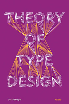
i received a press release regarding the imminent release of gerard unger's 'the theory of type design' some weeks prior to its release date of 20 september and took the opportunity to request a review edition from nai publishing to feature in these black and yellow pixels. not entirely unexpectedly, i received a confused reply, offering alternative, bicycle-related titles that were thought to be more appropriate for a blog concerning itself predominantly with road-going bicycles. argumentative to the last, i replied, including links to previously published articles in which i had featured aspects of the typographic world, relating those to the bicycle stuff that constitutes the bulk of thewashingmachinepost's considered output.
it appears that i made a convincing case, for a review copy duly arrived.
for those every bit as confused as the publisher's publicity department, let me offer a brief explanation. cast your eye briefly to the lettering at the top of this page, announcing that this is indeed, thewashingmachinepost. the tyepface in which this is constituted emanates from delaware's house industries and is entitled velo. the late rich roat of house was kind enough to send the image from which my heading was extracted, prior to my purchasing the entire font. this excellent typeface is available not only on the downtube of exhibited steel bicycles, but decorating a wool cycle jersey, casquettes and several other bicycle related items. because, like it or not, type plays its own considerable part in the life of the bicycle.
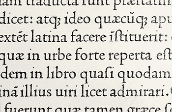
with the ever increasing size of the road bicycle downtube, the manufacturer has a larger area of real estate on which to advertise the bicycles origination. and in a world where the bulk of today's peloton is born in a handful of taiwanese factories, designed by computers running the same software programme, differentiation has become the name of the game. what better way to accomplish this by way of the stylistic application of a memorable, high profile typeface? you may well be able to reason that type design impinges not upon your day to day, but i, for one, would beg to differ. and, to a certain degree, i'm sure that mr unger would wholeheartedly agree.
i cannot disguise the fact that 'the theory of type design' is a particularly learned work, heavily slanted towards the academic approach. that, in essence, may restrict its attraction to those of us concerned with the minutiae of type design; how varied are the counters; are the descenders long or short; does the kerning work every bit as well at headline sizes as it does in body text format? you'd probably think such matters to be beyond the scope of the average cyclist and you may well be correct. but if nothing else, it may help explain why some downtube lettering looks a tad better than its neighbour.
in his revered book 'one more kilometre and we're in the showers', author tim hilton points out that there is a disproportionate number of individuals with artistic/design leanings, a fact no doubt considered by the majority of cycle manufacturers when debating the graphics and lettering applied to their products. for those who identify with hilton's assertion, a copy of 'the theory of type design' may prove every bit as essential as a copy of peter sagan's forthcoming autobiography, or 'les cartes du tour' by paul fournel. gerard unger opens the first paragraph of his first chapter with an undoubted truism.
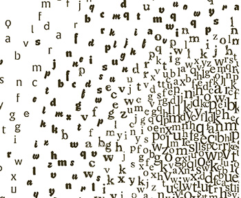
"Of all designed objects, letters are probably the most pervasive, very familiar, yet amazingly diverse in their appearance."
it is this very diversity of appearance that provides cycle manufacturers (for example) with the means to differentiate their product from the competition. but in so doing, it is necessary for several someones within the industry to have the knowledge expounded within these 25 chapters. so, i hear you ask, why would any of this be of concern to me? well, other than those who approach their local bikeshop, velocipede in hand, to greet the mechanic with 'it's making a grinding noise', the intricacies of carbon fibre and its technical appendages are often of great concern to members of the pelotonese. we are renowned for spending many a happy hour or so, discussing the relative merits of double-tap and ergopower, educating ourselves as to the potential advantages of a twelfth sprocket, and learning of the improved rolling resistance brought about by a few extra millimetres of rubber.
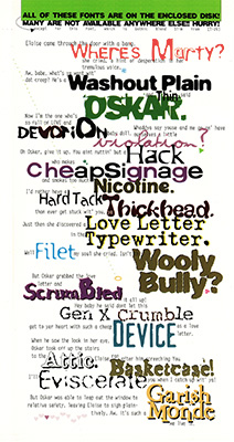
"The world would be less interesting and navigable if all the messages around us would be uniformly designed with one single typeface."
i appreciate that i am here preaching to a particularly narrow field of interest, that the majority will be more concerned with which specific jersey or jacket would be most appropriate for the weather conditions at hand. the size or flavour of lettering plastered about a dod of crafted carbon fibre is surely of secondary concern? but it would be particularly naive of this review to constrain appreciation of the humble and not so humble typeface to its tentative relation with the bicycle. the study and appreciation of typography is one that can be enjoyed entirely for its own sake and one that i've found to be particularly rewarding.
the author illustrates his points with considered aplomb, appending many an intriguing example to the latter portion of each chapter. even cursory study of this publication might well aid your choice of typeface if commissioning business cards, designing a fundraising poster or, to briefly return to the bicycle, leaving a well-designed note explaining that the bike shop is closed because you've gone cycling.
for those approaching the subject from a position of professed ignorance, unger is not only an accomplished typographer, but an admirable writer. aside from citing a wide range of original sources, his explanation of the nooks and crannies of type design are as clear as plate glass and, dare i say it, make for (relatively) compulsive reading. unlike many other so-called type manuals, unger has not set out to assist you in the identification of every typeface you come across in supermarket packaging or the exhibition stands at the cycle show. but he will help you understand why the spacing doesn't look quite right on your 'who the hell is peter sagan?' t-shirt.
one of the christmas list.
friday 28 september 2018
 ..........................................................................................................................................................................................................