
..........................................................................................................................................................................................................
manifestos do not good posters make, atmo. unless...
a few weeks back i was attempting to take a photograph of a building from an elevated position, a situation that necessitated a visit to the upstairs office across the road. while making my way to the room with the appropriate view, i passed a closed door with a printed sign taped to it. the lettering used on this white piece of paper was zapf chancery, somewhat of a cliche in design circles, but as if that wasn't bad enough, the text was all in capitals. this is perilously close to a hanging offence. scripts are not designed to be used entirely in uppercase; a capital followed by lowercase is the very least we deserve, though preferably signs should not be printed in zapf chancery in the first place (for the uninitiated, zapf chancery looks remarkably similar to the script used on carbonsports lightweight wheels).
thewashingmachinepost, on most folks' computers, is displayed in a font called georgia. i know that sans serif screen fonts are generally the better option, purely due to the limitations engendered by trying to display serifs at small sizes on today's flat screens as well as crt monitors, however, georgia has been specifically designed to get around this problem, and it looks far more eloquent than arial in my opinion. i have no desire to go into the whys and wherefores of style sheets on web pages, but basically it is only possible to specify fonts that are likely to be installed on readers' systems, and georgia is one of them.
apparently html 5, the next generation of markup language for web developers, will cure this problem by allowing the referencing of fonts installed on the web server, ignoring whether or not the fonts are on users' computers. however, the thought of more html (hyper text markup language) scares me to death; as if everything wasn't complicated enough already.
but typefaces are intrinsically of interest, often creating a greater degree of clarity and atmosphere than the words alone. i like words, i like typefaces (most of them) and i like photos and illustrations. i don't like numbers, and they don't like me; it's a comfortable relationship. typography was one of the subjects i studied closely at college, and while i am a long way from being an expert in the subject, it still fascinates almost as much a bicycles. there are others in the world who have not only a greater degree of expertise in the world of letters, but who design and sell them for a living. and, believe it or not, just such a collection of individuals sponsors a cycle team.
house industries became the company behind the name in the spring of 1994, releasing their first 'themed' collection entitled the bad neighbourhood the following year. their current offerings are often eccentric and idiosyncratic, so it really should come as no surprise that, when allocating sponsorship for the 2009/2010 cyclocross season, the house industries name took pride of place on the front of richard sachs' team jerseys. and with the team's rather fine string of results, the people in da house, were well pleased.
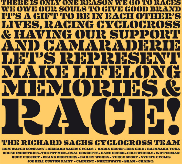
you may recall my screening of the richard sachs team manifesto, where mr sachs instilled the team's raison d'etre to those racing in team colours on sachs frames. it was, to put not too fine a point on it, inspirational, a point of view shared by many of those who read it. next week (feb 26-28), the north american handbuilt show takes over the greater richmond convention center, in richmond, virginia for its annual display of all that is good and great in the world of bicycles, built in more traditional fashion than is the case for your average taiwanese factory. happily it won't just be the bicycles that are handbuilt.
on the 11th of march, house industries will release its latest font collection entitled eames, an example of which can be seen as you entered the page, and again to your left. for those of us who could acceptably be described as fontaholics, this typeface is almost as exciting as the possibility of drooling over a red sachs steel frame in the flesh. and it may not have escaped the attention of many that the text beautifully described above is a subtle contraction of the manifesto that is a central character in this article. so far, so good; but i promised you hand-built.
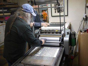
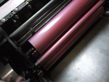
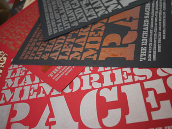
a few days past, ben and rich of house paid a visit to lead graffiti, a print house in newark, delaware to hand print superb versions of the above on a vandercook cylinder press, from a photopolymer plate. the end results will be available for sale on the sachs stand at nahbs in a beautifully symbiotic relationship between racer and sponsor, between bicycle and printing press, between manifesto and typeface.
i love it when a plan comes together. watch the poster being printed here
richard sachs | house industries | lead graffiti | nahbs
posted thursday 18 february 2010
..........................................................................................................................................................................................................