
..........................................................................................................................................................................................................
better by design
i was reading only the other day, an article entitled 'you must be able to sell, too' by the esteemed richard sachs, in which he was wont to quote a philosophy of the respected japanese potter gen-emon tatebayashi. in one of those situations where, when the obvious is pointed out, you realise why it was obvious in the first place, tatebayashi was keen to enlighten, while the art and skill of the potter is all but paramount, all comes to nought if the potter cannot also sell his product too.
it's a situation we've all come into contact in one way or another. many of us would probably love to spend the rest of our days involved with bicycles, possibly to the exclusion of all else, yet unless we find some way of paying the bills as a result, it will remain forever a pipe dream. similarly the craftsman; being the master of one's trade is somewhat vacuous if there are no commercial implications. suffering for one's art can take you only so far.
in which case, assuming that we are indeed the hypothetical master of our trade, with little in the way of sales acumen, might it not be a smart move to have someone to turn to, someone who might provide their own set of skills, subsumed on our behalf? take a walk up renfield street in glasgow and you are all but sure to come across a carefully designed (though often roughly printed) poster, slapped across the box of electrics that controls the traffic lights. frequently these are accompanied by a plethora of other, perhaps out of date posters advertising the latest band to emerge from the depths of the scottish music scene.
though said band may have been rehearsing in a dank garage somewhere in the principality to the point of musical perfection, all is indeed lost unless we, the general public are alerted to their latest (and possibly last) musical outpourings. that's where posters, pamphlets, logos and tickets come into their own. and someone with a natural or cultivated empathy with the band's image and/or musical fortitude has sweated mightily over associated graphic material.
as the folks at emigre have said more than once, 'design is a good idea'.
artist rebecca kaye fits the bill perfectly. not, you understand, that i have come across scrappily produced music posters decorating glasgow's junction boxes produced by miss kaye, but something far more pertinent to the conversations we have enjoyed over the past few years. rebecca offers many superb graphics relating to the sport of cycling, though not exclusively. in point of fact, you may well have come across examples of her expertise in totally unrelated situations; not only does rebecca know how to help others sell, she's perfectly capable of selling herself.
there's no doubt that an art college degree might help along the way, particularly if employment is uppermost in one's mind. granted, self-employment is often the mainstay of the aspiring artist, whether in the graphics milieu or otherwise, and in that case, ability is surely more pertinent to the situation? so though perhaps a tired and cliched question, i figure it necessary to ask; is rebecca a formally trained artist, or simply pretty darned good at it?
"I'm not a formally trained artist by any means. I originally studied mathematics at Manchester University and latterly creative advertising at Napier. I've always had an interest in design but I'd attest most of my skills to a very long reading list of brilliant graphic designers and illustrators."
with the advent of the interweb, existing as an artist, particularly in the field of graphic design, is no longer a case of dwelling in one of the uk's more populated locations. more often than not, london, but with a dollop of leeway offered to the larger metropolises dotted up and down the country. is rebecca based somewhere nice? somewhere in the heart of cycle sport perhaps?
"I was born in Wales, but now based in Edinburgh. I'm obviously attracted to hills."
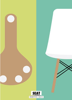
even a quick reconnaissance of the graphic art produced by rapha in perren street, mostly the preserve of messrs coyle and saunders, will testify to the old adage that simplicity is often the best policy. this is an edict encapsulated in the work of rebecca kaye, where there is ample evidence of a most sophisticated of simplicity. is this a conscious effort on her part or simply the way she's wired?
"Definitely conscious. The long reading list I mentioned, is heavily influenced by Swiss minimalist design. I love the simplicity and more importantly, the meaning behind good design. I think the best design has a strong thought process and I guess that's what I try to aim for."
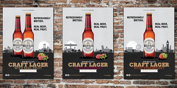
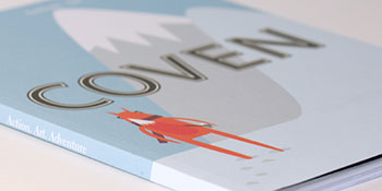
rebecca's website displays a wide-ranging set of perspectives, offering up work that concerns itself with more than just the two spoked wheels of a bicycle. graphics that promote and illustrate the joys of 'coven' magazine, graphically describe the flavours of 'melville's fruit beer', give currency to channel 4's 'the bank of dave', yet find themselves on display at a vulpine fete. many of us will have found our way, even inadvertantly, to her artistic prowess via the bicycle. does this mean she's as obsessed as the rest of us?
"Yes. I have a pretty competitive mindset, but strangely enough the bicycle is one of the few things that I'm content just to enjoy. Nothing beats riding a bike for letting your mind wander, especially when you have breathtaking scenery like Scotland."
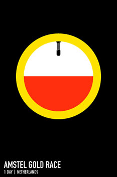
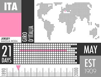
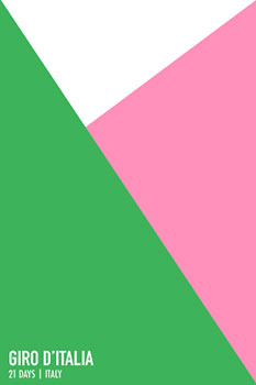
and yet at least a portion of this obsession works itself cleverly by all but denying the existence of this object of desire. displayed on rebecca's website is an excellent series of graphics depicting the races of the uci world tour. not content to merely restrict herself to the more common poster, kaye has accompanied each chosen race with a set of cleverly devised infographics, yet again portraying her command of the simple yet effective. however, range through the giro d'italia, tour of romandie, liege-bastogne-liege, and fleche wallone, amongst others, the one feature conspicuous by its absence is the bicycle. was this a deliberate ploy?
"Yes. Both reasons link to my answer about simplicity. The bike seemed to be an obvious element that didn't add anything to the design. I also wanted to make the race posters about the history of the races as opposed to just another race about a bike. There's a phrase I heard a while ago that states 'If you say three things, you've said nothing'. That really resonated with me and with the race posters I just wanted to say one thing and try to make it memorable."
in the process of providing graphic solutions in my own day to day work, it more often than not takes an inevitably long time and a whole slew of options to reduce this agglomeration of ideas down to one of effective simplicity. at that point, i often wonder why it was such hard work to arrive at so few marks on paper, or more likely within the user interfaces of adobe illustrator or photoshop. does rebecca find it a lengthy process to achieve a successful end result, or do the images simply roll off the pen/pencil/copy of adobe illustrator?
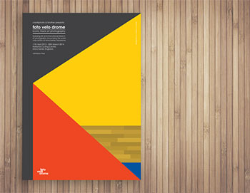
"For the images that look simple, I spend ages. For the images that look like they've taken ages, they roll off Illustrator."
i have always likened the skill of learning the ins and outs of software such as illustrator and photoshop as akin to those of learning how watercolour paints react with each other, which brush is the more appropriate choice for oils, gouache or inks and even which weight of pencil to use for sketching. though software carries a learning curve somewhat steeper than any of the traditional media, in the days of digital reproduction, it ill behoves the contemporary graphic artist to remain with head firmly planted in the sand. is rebecca a hands-on artist with ink, paper, brushes etcetera, or is she more comfortable with the world of pixels and vector graphics?
"I spend most of my time writing about the reason for the design in a small notebook (with an actual pen and paper). All my images are then created in Illustrator (as vector graphics). The latter part is usually the quicker bit. Most of the prints in my online shop are screenprints and I print all those by hand in Edinburgh with ink, paper, screens and squeegees."

to return briefly to my opening gesture regarding the ability to sell (both products and oneself), the commercial artist, in order to eat, must often survive on a hopefully steady diet of commissions that will pay the bills, even though they may have little or nothing to do with the ideals or obsessions held dear, if somewhat submerged. rebecca has already identified herself with most who inhabit these black and yellow pixels; the bicycle is paramount to a greater or lesser degree. what then would be her ideal illustrative cycling commission?
"A series of stamps for Royal Mail to commemorate Britain winning a green, yellow and polka dot jersey in the same year."
those hypothetical posters randomly dotted about glasgow city centre may not offer the ideal gallery in which to display one's graphical expertise. even if the style of one catches the eye on the way to buchanan bus station, there's every likelihood that the progenitor will remain anonymous. similarly, work displayed on television more frequently remains uncredited at point of viewing, though printed matter often cordially provides modest accreditation. however, the art of design is every bit as visually valid as a turner or auerbach oil painting hanging on a gallery wall.
so, other than on web, print and tv, is there a physical spot in which the work of rebecca kaye can be viewed by the appreciative cyclist? "My work is available in a few shops in Edinburgh including Ronde, as well as other cycling shops/cafes such as Velocity in Inverness and Look Mum No Hands in London."
the world of professional cycling is one currently steeped in at least superficial glamour, colour and excitement, factors that are immeasurably enhanced by the outpourings of artists such as rebecca. and in my opinion, they're worth every bit as much as the blue stripe on the back of sir bradley's jersey.
thursday 9th may 2013
