
..........................................................................................................................................................................................................
design by numbers
in 2007, as i prepared to ride the hot chillee londres-paris, the nice people at nokia offered to lend me a mobile phone with their latest gps tracking software for review. i spent a morning with their public relations people having the operation of the phone explained to me, a real necessity since i am still bereft of a mobile to this day.

it turned out to be a case of 'close, but no cigar', as the bungee cord fastening it to the bars obscured the buttons required to pause and restart. add to that the fact that the battery gave up the ghost after six hours into an eight hour ride, and you can perhaps see why i failed to give it a glowing review.
however, on my return to euston station, with nokia having kindly provided a substantial amount of pay-as-you-go pennies, none of which had been used in the process of riding my bicycle, i proceeded to send a text to mrs washingmachinepost to advise of my safe return. unfortunately, as a mobile phone agnostic, i had no idea how to place a space between words, resulting in a text containing probably the longest word in the english language.
only a matter of days later, apple released the first iteration of their iphone in a form factor that pretty much no-one saw coming.
nowadays, finding someone with the old-style phones, with a square screen at the top and a tactile keyboard below seems so old fashioned. pretty much every manufacturer very quickly produced a phone featuring a full-size touch-screen, though nokia has since been subsumed by microsoft and re-named lumia. but even in the world of moore's law and endless technological advancement, it would take a brilliant chunk of lateral thinking to bring something totally unexpected to market in this age of 'seen it all before'.
however, in a far less groundbreaking field and pertaining to a considerably smaller audience, rapha's recently released 'data print' could also be described as something that few folks saw coming. the endless round of spring/summer and autumn/winter clothing releases that occupy the fashion industry can often seem simply an excuse for new colours applied to existing products. though innovation continues apace, it surely does no harm to refresh the existing ranges with impressive new colour combinations.
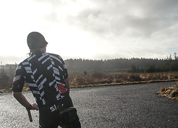
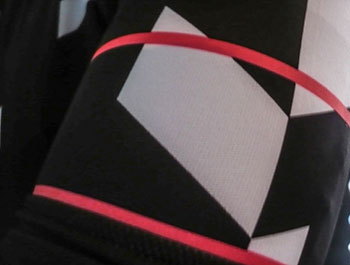
but rapha's recent pro-team release, including a short sleeve jersey, arm screens, cap, baselayer et al, features a striking graphic created by design studio accept and proceed, gleaned from sky rider peter kennaugh's race data from 2013's tour de france. though others, notably massif central, have produced data driven graphics, this is the first time i believe such has been applied to an item of cycle clothing. though there can surely be a preconceived notion as to what sort of graphic is required, the specific details can only be ultimately described by the original data.
to find out more about the graphic's origination, i asked accept and proceed's matthew jones how they went about converting the data from kennaugh's tour into the graphic featured on the jersey. was it a manual effort or was some inscrutable piece of software employed?
"ItÕs a manual effort, actually. I'm sure you could write an algorithm, but we're not coders. We simply plot the data through a series of Êvisual filters, and see which one works best with the data set. We aim to have a dramatic shape each time and different numbers work with different filters."
in an effort to better educate myself as to the joys of data driven infographics, i rummaged around on the interweb to find software that did as it was bid by the numbers. though i have a past and present in the world of graphic design, i'm not sure i like the thought of handing over my flimsy design skills to a sequence of numbers i barely understand.
 however, there's no denying it's an intriguing approach to the representational milieu. but it's the perceived lack of human control that would concern me. did matthew have ultimately control over the graphic presence of the processed information? in other words, was the final intent already in place before the process began?
"Yes. We always create a 'sketch' to test whatever filter we will apply to the data. Often we have the end graphic in mind, and try to create a suitable pattern to fit the information it's displaying. With the Rapha data pattern we tried a number of different effects, including circular looking graphs before settling on the final one. It has a look of both speed and tyre tracks."
of course, the unwritten laws of brand management dictate that it is generally insufficient to merely offer anodyne illustrations of the available products on a website. doing so in isolation is rarely inconsequential, but often lacks the impact of a photo shoot and accompanying video. in this respect, the collaboration between rapha and accept and proceed did not disappoint.
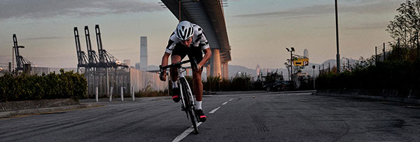
clocking up just over ten years as first call rapha photographer, ben ingham met up with peter kennaugh to photograph the sky rider in his new data print kit aboard a matching white pinarello in hong kong. this, i confess, struck me as a tad extravagant; surely there was a location closer to home in which mr kennaugh could have been photographed? after all, ben ingham's photography looks pretty darned amazing no matter the nationality of scenery providing a backdrop. rapha's james
 fairbank explained that "The arrival of our samples often forces us into the Southern Hemisphere in search of relevant weather.ÊBen and I were shooting near Wanaka, in New Zealand's deep south and thought that Hong Kong would be the perfect backdrop for the Data Print pattern. Hong Kong's also a pretty incredible place to ride a bike, topping out at almost 500 metres."
not as pretentious a location as i thought.
and so to the video. if you've not already viewed this, i'd suggest taking a quick click over to vimeo to see of which i speak. though it only lasts 37 seconds, in combination with the jersey and ben's photos, it is the cutting edge of contemporary icing on the cake. how did matthew at accept and proceed manage to create such a stunning effect?
"The video was created in a combination of After Effects and Cinema 4D. We modelled a 3D rider and mimicked cyclists' gestures as the basis of the film, then mapped the chevron design to the movements.
i didn't see any of that coming.
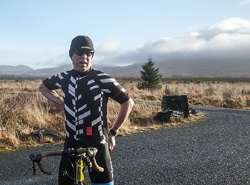
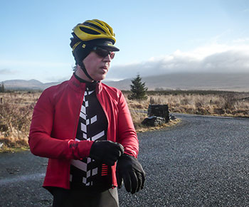
the jersey itself is every bit as good as expected from rapha's pro-team range. like all the clothing emanating under that moniker, it lives very close to your shape; when zipped top to bottom, there's not a square centimetre of flappage to be seen. it works very well over the top of the recently released softshell baselayer, since the sleeve length obscures even the latter's lengthy softshell sleeves.
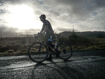
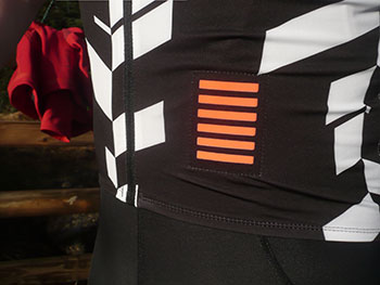
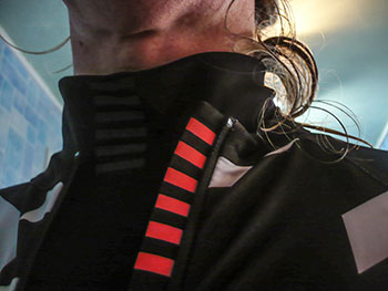
i'll not fib; the weather up here is way too cold to be riding around in a short sleeve jersey. that delight will probably have to wait until the month of july is heading tha calendar. however, sandwiched between a pro-team softshell and the aforementioned baselayer demonstrates a flattering versatility. the screened fluorescent pink/orange pro-team logo (the data print is dye sublimated) contrasts very well with the monochrome print, adding a welcome touch of colour at the same time.
the print, though bold, looks the absolute business and despite its graphic heritage, not in the least contrived. my only complaint regarding the jersey is the complete lack of a fourth, zipped pocket in which to conceal my coffee money. but i suppose for the professionals, that's what the team car is for. though it features not my club colours, the rationale behind the softshell baselayer was convincingly confirmed.
it seems that agglomeration of data may well be the future after all.
accept and proceed | rapha data print range | top photo by ben ingham
sunday 1 march 2015
 ..........................................................................................................................................................................................................