
..........................................................................................................................................................................................................
abstraction
more years ago than is comfortable, in the day's when debbie's was debbie's and not, as it is now, aileens, we (meaning i) designed a cycle jersey. the long tradition on islay of continuing to refer to local businesses by their apellation from an almost forgotten past means that aileen's is still debbie's even though it's really bruichladdich mini-market. by way of example, the recently opened sea salt restaurant in port ellen is housed in the building formerly known as the davaar café. i can guarantee that there will still be many who continue to call it the davaar for a good number of years to come. similarly, bowmore's cottage restaurant started life as the galley, a term by which it is still often referred.
and purely to fulfil steve jobs' contention that statements ought to contain three examples, jimmy campbell's shop at bridgend, recently taken over on mr campbell's retirement, will probably still be known as jimmy's several decades hence, even though it's now run my mr and mrs birse.
but, meantime, back to that jersey, an example of which some of you may already own. the original retro-based design of maroon, cream and black is now in need of an update, not because of any design failure, but one of the advertisers referred to by way of a printed web address on back and sleeves, is no longer resident on the isle. gentle persuasion to have aileen agree to order a re-run has come to naught over the past few years; there's no disagreement, purely, it seems, a lack of willpower.
much like being in a rock band, designing a cycle jersey is every bit as confounding as coming up with a suitable name for one's musical endeavours. there is nothing worse than appearing on stage in a local village hall, espousing the cutting edge of rock'n'roll at an ear-splitting volume with an altogether less than impressive name. and heaven forfend that the name on the bass drum appear on a cd cover offering national embarrassment.
designing a cycle jersey is fraught with similar difficulties. a bit like writing a tune but being convinced you've heard it somewhere before, there's always the scary thought that you'll open a cycle clothing catalogue and see a verisimilitude of the exact image just sent for dye sublimation that very morning. in truth, the amateur such as myself tends to lean heavily on the conservative side of design. it's nice to produce something with a smidgeon of originality, but not anything so original that there is a constant round of sniggering at the back of the peloton.
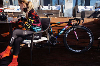
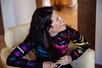
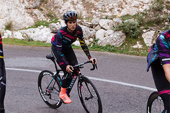
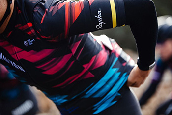
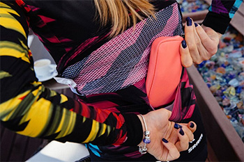
commerciality, however, offers a whole 'nuther clean slate on which to work which is, not to put too fine a point on it, precisely what rapha's ultan coyle did for the canyon/sram women's kit for 2016. revealed today for the first time, ultan's inspiration for this rather striking design was "the warning tape you see used on building sites and along the street; specifically when there are multiple layers wrapped around scaffolding poles or broken lamp posts to highlight potential dangers. I liked the idea of wrapping the body in the tape to suggest an athletic threat or danger to add attitude and which would come in handy when racing, so the tape formed the basis for the print which we then we re-coloured, or electrocuted it, to make it more striking."
with reference to the last few years when rapha have been responsible for providing clothing for team sky, there's little doubt that the chaps and chapesses at imperial works rarely do things by half. thus the women's canyon/sram team will receive "a wide variety of clothing for allÊweather conditions, from deep winter items to jerseys made of the lightest material available for hot weather and time trials.The team will also be provided with casual wear based on Rapha's main City range, featuring team branding."
wassily kandinski is most often credited with having been the first artist in history to produce completely abstract art, imagery that ostensiby made no reference to concrete or identifiable objects. the apparently randomly abstract nature of the canyon/sram kit does, however, have a certain degree of underlying pragmatism according to rapha's chief marketing officer, sarah clark. "We wanted to have the practical features stand out in the peloton to help the ladies find each other at crucial moments."
now i would never have thought of that.
friday 18 december 2015