
..........................................................................................................................................................................................................
a new look
though something of a sweeping generalisation, it would be fair to say that if you wish to portray a modern corporate image, a sans serif typeface would be your first choice. a knee-jerk reaction would be to point the finger at helvetica, a typeface designed by max miedinger in 1957 and widely used in logos and signage all across the world. it has become as much a maligned typeface as it is celebrated due almost entirely to its ubiquity. a bit like the remarkably similar arial typeface - still i believe the default font on microsoft word - it is an easy solution for those without the time or knowledge to research a viable alternative.
in the nineteen eighties, an often overused mantra was that of 'no-one ever got fired for buying ibm', which may have an uncanny parallel with use of helvetica. though the latter was scarcely the first sans-serif typeface to arise, many logos and signage prior to its devising used the more common serif typefaces such as garamond and times new roman. tendentiously unrelated to logo design, though the difference may be lost on many, it is reckoned that the serifs (the little feet at top and bottom of each letter) offer a better reading experience at small sizes. it's the reason why the post appears in georgia, though even that may be thought contentious by some.
because each screen pixel is of fixed size, the serifs are not always reproduced authentically on a computer screen. thus contemporary thinking would suggest using sans-serifs for on-screen reading. however with the recent introduction of high-resolution screens to the world of the computer, tablet and phone, this particular argument starts to pale in its authority.
logos fall into two distinct categories; those involving some form of graphic or design, and those constituted entirely of lettering. granted, there are probably many that stand astride both camps, but in my experience, one feature is generally more dominant. for instance, the best of the former category are usually recognisable even if devoid of accompanying lettering. for example, apple, shell, adidas, mercedes etc.
mavic, beloved of those requiring neutral service, and responsible for the ksyrium wheel, at one time every bit as ubiquitous as that helvetica typeface, came into being in 1889 by way of a nickel-plating business operated by léon and laurent vielle. a little later that same century charles idoux and lucien chanel had the clever idea of offering bicycle spares for sale to an emerging and growing market.
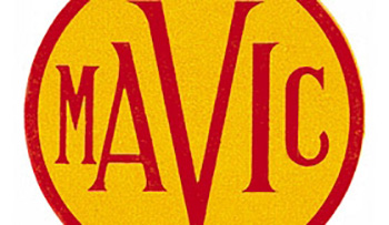
léon and laurent settled on the brand name ava, while the other fellows created mavic, (manufacture dÕarticles vélocipdiques idoux et chanel). the common factor was their president. mavic was born. obviously enough, since the name was effectively an acronym, it made sense for the first of a series of corporate logos to incorporate those letters. mavic's first used the letter 'v' as its central figure, sandwiched between diminishing forms of the others and placed within a circle.
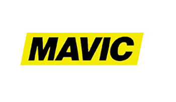
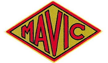
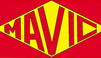
it was forty-two years later that a revised logo appeared, maintaining the proportions of the letters originated in 1923, but effectively losing the serifs. the circle had gone by now and the word mavic was now encased within a diamond shape with a gold background. by 1973, the diamond remained, but now set within a rectangle of red and the letters had taken on a more graphic appearance. five years following the introduction of mavic's first wheelset in 1983, all became considerably simplified with a bold black sans-serif typeface set on a yellow background, remarkably similar to the modern day incarnation.
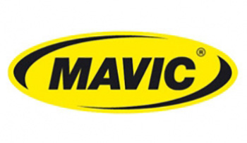
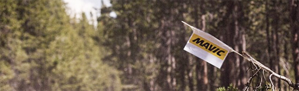
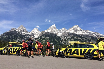
the only change between then and now was the arrival in 1996 of the ellipse that now owned those five letters, augmented by a top and bottom black swoosh. i once enquired of mavic's press office in france whether it was possible to acquire one of the team polo shirts worn by the very chaps that leap energetically from the neutral support car, wheels in hand. sadly, it seems you need to be employed by mavic to have the honour of hanging one of those in your wardrobe.
however, i do have a zipped jacket featuring an embroidered original 1923 logo that i purchased from the mavic stand at the north american handmade bike show, sacramento, 2012. i have yet to learn the art of leaping from yellow skoda estate cars.
but, there is nothing as certain in life as change. sometimes that change is brought on by necessity, sometimes it's simply a sign of the times (if you'll pardon the pun). at some point in the relatively recent past, mavic began augmenting their logo with a bold serifed letter m, often seen on the front of their helmet range and on the shoulders and sleeves of their jackets and gilets as well as the buckles of the shoe range. occasionally, logos or their derivatives do not travel as well as their designer may have expected.
domestic cycling team jlt condor gained mavic as clothing sponsor and a 'presented by' on the yellow panels on their bibshort legs for the 2015 season. those of us who consider ourselves amongst the cognoscenti in such matters, would inevitably identify that bold m as belonging to mavic. members of the general public (as they like to be called) however, are less well versed in such intricacies and were in danger of seeing that letter as being associated with supermarket chain morrisons. locally, something of a corporate faux pas, if you will.
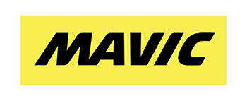
so, perhaps as a result of the latter, but probably more likely simply a modernising of one of cycling's longest serving benefactors and technology companies, the logo has morphed once more into that seen in the latter stages of this article. it is already writ large across those essential, yellow neutral support cars and will soon make its way onto wheels, tyres, rims, clothing, helmets and shoes. you should see this reflected in the jlt condor team kit from august onwards, every bit the sign of quality that it has been for the last 126 years.
special thanks to claire beaumont of condor cycles/jlt condor and mavic uk's alex coventry for their assistance.
tuesday 7 july 2015