
..........................................................................................................................................................................................................
house industries rich roat interview

cycling has many different sponsors, but i don't think i've come across a type foundry on a jersey before. how did that happen?
I met Richard Sachs at a small cyclophilic gathering called the Finger Lakes Ramble, along with a bunch of other independent framebuilders. About a year later, I happened to be reading one of the cycling forums and saw that he was working on his new kit, so I dropped him a line to see if we could get involved somehow. It was just kind of a lark. But once I got to know him better, I thought that there was a certain correlation with his manifesto and our sometimes quirky "business" model.
would you have considered anyone else other than richard sachs?
It was kind of a chance encounter that turned into something really great. Not that we wouldn't consider another such relationship, but we're not a corporate behemoth and can only afford so many irons in the fire.
what type of customer (pardon the pun) were/are you trying to reach?
I never really looked at it that way. The best laid marketing, promotional and public relation plans usually end up looking contrived. We saw Richard Sachs and the 'cross team as like-minded entities, so we wanted to support his scene. I think that type of grass roots involvement is so much more sincere.
has it worked? are you happy with the results?
It did, in a surprisingly organic way. We were surprised by how visible Richard and the team are during the cyclocross season. Richard is racing. When he's not racing, he's getting the rest of the guys ready, manning the pits, washing bikes between laps and driving the van eight hours after the race. Oh, and he builds all of the bikes, hustles all of the sponsorships, maintains the relationships and runs his business. That's passion. Who wouldn't want to be associated with him?
could you see opportunities for other independent foundries to get involved in cycling sponsorship?
I find myself repeating this thought a lot lately. If I were to write an MBA thesis about running a font foundry, I probably wouldn't use House Industries as an example. That said, the involvement created some hype, and that hype creates hits and hits pay the bills these days no matter how old school your dial telephone is.
I hope more people jump in. It would be great to see the cyclocross gain more traction in the United States.

are any of those at house industries avid cyclists? do you all go out for a wednesday morning ride like the guys at rapha?
House type designer Ben Kiel and I try to get out for a 45 minute spin a few times a week, but I don't think we could compete with the Rapha ride aesthetically or athletically. Well, Ben maybe, but not me.
how long has house industries been in existence, and how has it developed over the years?
Andy Cruz and I started the company in 1993 and have been selling fonts since 1994. Faces, places and problems have changed, but our philosophy has not.
do you see yourselves at house as an east coast 'emigre'?
I could see where you would draw a parallel. Emigre broke a lot of ground for independent digital font companies and they were very supportive of us in the early days. We also did a lot of fun projects together. I think it could be said that Emigre sold fonts to support their design habit, and that's how we look at ourselves as well. Aesthetically, I think we're even further apart than we are geographically.
is it a fragile existence as an independent type foundry in these days of free fonts seemingly everywhere?
Anyone dealing in intellectual property lives a fragile existence. We survive on the quality of what we produce and the good will of our customers, without whom we would not be able to come out with the Next Big Thing.
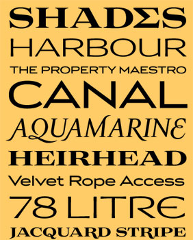
why would someone like me consider buying from house rather than scouring the web for freebies?
Although there are some really great free fonts out there, you quite often will get what you pay for.
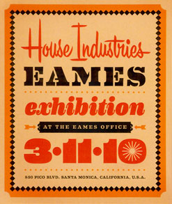
you printed some rather magnificent posters for richard sachs at nahbs using the recently released eames font. has this latter release been a labour of love?
If it wasn't a labor of love, you wouldn't see it in our collection.
what exactly goes into producing a new typeface?
We started working on the Eames collection in earnest over three years ago, although we first started talking to the family in 1999. For us, there's a lot of historic research, then even more hand wringing as we try to create beautiful and functional typefaces that honor their source material. We partnered with Dutch type designer Erik van Blokland to create the main text family, and I know he spent a solid three years on that alone.
are you sometimes excited by the uses customers make of your fonts?
We're kind of immune to it in many ways. We have unintentionally propagated just about about every angle of the visual landscape with either our fonts or little bits of lettering that we've done over the years. I don't get to the mall much, but yesterday I was stepping on floor tile with our Funhouse font (1994) as I walked by Build-a-Bear workshop and we just found this Oscar-winning short film peppered with an obscure logo that we drew in 1996:
Still trying to figure that one out.
with the advent of html5 and web fonts, is this an area you see yourself entering? will we be able to purchase web versions of eames, for instance?
We have been working on web font development for about 18 months now. As much as the web design community would like to believe it, there is still not a consistent solution for using fonts on the web. @fontface has a fundamental licensing disconnect that gives us (and many other independent type designers) severe stomach aches. Plus it flat out does not work in Internet Explorer. EOT works great in Explorer, but, as the German government has pointed out, it creates some really nasty security holes. However, W3 has formed a working group and looks to be getting very close to a universal solution.
In the mean time, we are working on specialized web versions of selected fonts. Eames Century Modern is at the top of this list because we think it is well suited to be used on the web.
will you continue your sponsorship into the 2010/2011 cross season?
Absolutely, if Richard will have us. Since Granoque 'cross is going to be a two-day event this year, we're going to try to plan something special for that weekend.
can we look forward to a 'sachs' font in the near future, or perhaps an eames embroidered cycle cap?
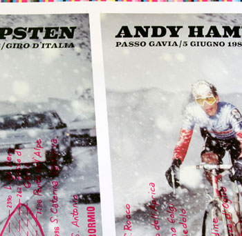
Naw, that would be too easy. Interestingly enough, we've been cooking up a bicycle font collection with our fellow cyclophile Paul Barnes for the past four years. The project has reached far and wide, with Steve Hampsten building a House Industries bicycle (awaiting a head badge), a Hampsten logo redraw by Paul Barnes, a new Cinghiale logo by our own Ken Barber, a litho version of the Gavia Pass poster (incidently using a very early version of Eames Century Modern), and a really cool serigraph
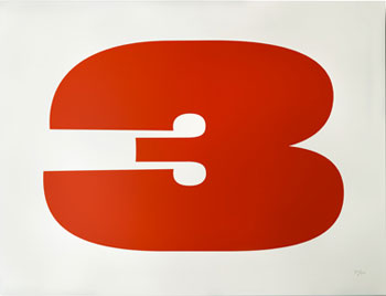 So far, the fonts have not reached beyond the conceptual stage, but the other stuff has been really fun.
what's the grand plan for the next few years, and when will world domination be completed?
I'm still trying to figure out how to make this drastic paradigm shift from the high brow Eames release two weeks ago to our little dirt-under-the-fingernails hot rod art hoedown in Austin, Texas next week.
World domination? You need Other People's Money, a business plan and at least a Platinum-level American Express card. But all of that takes the fun out of things.

posted friday 26 march 2010
..........................................................................................................................................................................................................