
..........................................................................................................................................................................................................
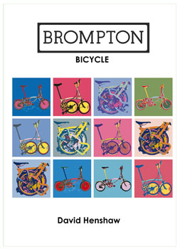
brompton bicycle - david henshaw. 152pp illus. excellent books £11.95
coincidentally, conversation on today's sunday ride happened upon the possibilities that could conceivably be made available should our local bus company offer the ability to carry bicycles. a portion of the fleet consists of rather ageing single decker buses, with no apparent luggage space, and certainly nowehere to put a bicycle should the driver be kind enough to allow it on board on the first place. as we currently understand it, carriage of bicycles on islay's buses and post buses (even more unlikely, to be honest) is at the discretion of the driver. however, two optare buses do operate the two main islay routes and that is where hope may lie.
west coast motors operate an optare bus between the ferry terminal at kennacraig and the claonaig ferry slip for the arran ferry and, i believe to the east loch tarbet ferry. and these buses proudly display a large graphic on the side window proclaiming that bicycles are more than welcome. we might get ourselves to the point of bending the ear of the islay operator to do likewise in the coming months, but that is an aside to the current discussion. the opportunity to put a bike on a bus, might encourage more to take to the bicycle even if only for part of the daily journey.
bicycles are rather unwieldy objects: not for riding up and down hills, round corners, along busy streets, or out in the open countryside, but certainly when you no longer wish to ride them, and opt for an alternative mode of transport. why couldn't they fold? surely no bus driver would refuse a small package of steel and wheels?
the history of the brompton harks all the way back to 1973, when andrew ritchie grew tired of delivering house plants in a morris minor van, and started discussing the possibilities of creating a folding bicycle that would allow easy storage at home, place of business and any alternative transport method encountered in between the two. the idea of a folding bicycle was not new, as one of the inspirations to do it better came from the bickerton folder already in existence.
it's the brompton's method of folding that has effectively ensured not only its longevity, but its survival in the face of the competition, and its current popularity. brompton sent me a p3 model about a year ago, happily folded in a very small box, and because i hadn't been smart enough to watch the movie on their website, i spent rather a long time trying to unfold it in the wrong way. i figured that any folding bike essentially folded in half in the same way as a book: wrong.
as any self respecting brompton owner and enthusiast knows, the rear wheel folds under the frame, while the front wheel hinges about the headset and junction near the front to come alongside in the opposite direction. the handlebars fold down to the right and click into a bracket on the front fork. quite ingenious, and david henshaw's book describes in great detail how this method was developed and refined, along with all the trials and tribulations met through brompton's lengthy history.
mr henshaw was at least partly responsible for assisting the company establish its dealer network in the 90s, so he has plenty of first hand experience of the bicycle, as well as what would seem to be unfettered access to documents, drawings and photographs that record an illustrious and inventive career.
if there's a criticism, it's the dryness of the writing, which never seems to reach the point of enthusiasm, something that obviously pervades the emotions of the many owners throughout the world. however, the biggest obstacle to reading such an engaging story is the page layout; it may seem trivial and even churlish to criticise, but books are supposed to be easy to read, and the use of a closely spaced sans serif font surrounded by smaller margins than absolutely necessary, made it harder work than i'd hoped. and sadly, there seems no rhyme nor reason to the placement of photographs and illustrations. none of this can undermine the quality of the words themselves, but it's unfortunate that the same degree of attention to design hadn't been paid to the book layout as andrew ritchie did to his beloved folding bicycle.
this is likely a niche book inside a niche market, but if you've ever owned, thought of owning, or currently own a brompton bicycle, this would be a choice purchase, given that the back of the book gives details on maintenance, as well as the idiosyncratic variations on the original that have been developed by third party inventors and engineers.
great cover though.
'brompton bicycle' by david henshaw is available from cordee books at a cost of £11.95

posted sunday 21 february 2010
..........................................................................................................................................................................................................swobo merino cycle jersey
it's a lesson often learned the hard way, or at least it was for me, and the even harder part was that it took me far more years than strictly necessary or prudent to learn. any drummers amongst my audience will either offer murmurs of corroboration, or sniggers of derision, depending on how long the same situation evaded them. some may still be drumming in blissful ignorance. no doubt the same conundrum is a part of other strains of civilisation, but not being that civilised, one can only wonder.
the situation is this: when drum sets are photographed for the purposes of catalogues or websites, there's a strong likelihood, borne out by experience, that neither the photographer nor his/her assistant have any real affinity with drumming, other than being able to tell you that ringo starr occupied that chair in the beatles, and perhaps owning a copy of cozy powell's dance with the devil. thus. when setting up those delectable pieces of wood and metal into an array that will undoubtedly sell the whole package, the notion of ergonomics is unlikely to have been taken into account. the prospective purchases of said kit would likely need to be ambidextrous to an unhealthy degree, as well as in possession of asymmetric skeletal features.
of course, it will do my street credibility no good at all to admit that on receiving my first drum set many, many years ago, i was unaware that there was a pedal with which to play that big drum in the middle, nor that it should have been clamped to same. this readily explained why the pedal kept falling over. but it was the catalogue photographs that were the only hint and assistance the newbie buddy rich had to aid the setup of the percussive agglomeration, often resulting in a cymbal that required hailing a taxi to reach, and a hi-hat pedal that was most certainly not anywhere near the foot required to play it.
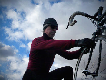
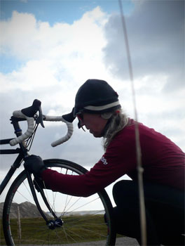
nowadays, the advent of both the interweb and a plethora of dvds are available to point the apprentice percussionist on the right track, thus saving their musclature from major creaking as they enter their forties. to a certain extent, those of us in the cycling fraternity suffer from a similar ailment: that of the publicity or review photograph. i can place this in a realistic timeline for you to illustrate that of which i speak. having received a long-sleeve, merino wool swobo jersey for review, the onus is placed upon the reviewer (me) to put the jersey through its paces in the raw, so to speak. certainly for photographic purposes, you would be less than impressed to see yours truly strike an aggressive pose with cappuccino in hand, dressed to the nines with waterproof jacket, woolly hat and neckwarmer, with only the assurance that underneath this outer shell was the swobo jersey. because i might be telling fibs.
but yet, were you to have purchased your very own swobo merino wool jersey, and been subjected to the rather unexpected heavy snowshower that met me on the way to debbie's this morning, you too would have been dressed in similarly protective manner. and rightly so. the upshot of this is, of course, the realisation that reviewing and testing an item of apparel often necessitates circumstances other than those proudly displayed in the adverts. because, in similar manner to those photographing drum sets, there's a strong possibility that neither the model nor the photographer would know a derailleur from a headset. surely no-one believes that the rather attractive girl in the assos advertisements really cycles around with her hands over her boobs when wearing bibtights? or that her male companion has an upper body matched by any cyclist we're likely to meet in the real world?
under the present weather conditions (it is still winter, after all), this particular swobo jersey has received the gamut of sartorial conditioning to which it may have to become accustomed. the initial ride was carried out as a deed of bravery, since the ambient temperature had yet to reach zero, and my reviewer's mind was still clouded by the thought of those catalogue pictures. how could i conscientiously review any jersey while it was buried under a couple of other layers? how would i know whether this played to its strengths or not? forty-five kilometres is, i feel, a reasonable distance to pedal in the cold with merely a gilet as a safety net in case the merino did not live up to its promise.
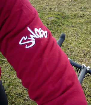
i cannot tell a lie; the jersey was a lot warmer than the thickness of its merino promised. this particular strain of wool has rapidly become a mainstay of the cycling world where 70kph sprints do not feature heavily. it is highly comforting to be sat on the comfy couch at our local java hostelry, looking like a cyclist and not like an advertising hoarding. the sort of garment that could cheerfully be retained at point of arrival without taking on the appearance of a sore thumb. the swobo jersey almost manages to slip into naomi klein mode (no logo), but for the embroidered appearance of the familiar trademark on the left upper arm. and nicely drop-shadowed it is too. the cranberry red colour finds great favour with its wearer, and exudes a degree of quality that its manufacture is happy to live up to.
cuffs and collar are ribbed, the latter being of appropriate height for this time of year and weather, while the front bears a half-length zip, should exertion ever get the better of the incumbent cyclist. body length is good and the fit even better; the jersey is nicely tailored to flatter the apprentice athlete and the seams flatlocked for comfort. always the first thing i look for in a jersey of any ilk, the sleeves are generous in length, contributing to a lack of cold draughts at the wrist junction. disappointingly, the uci mandatory zipped pocket is conspicuous by its absence, but the three rear pockets feature elasticated tops, something you don't see on many jerseys these days. two loaves of bread, a roundel of brie and a container load of inner tubes would be comfortably ensconced within.
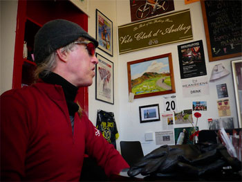
wool as a jersey fabric was once considered retro in appearance, and may still be thought thus in some circles, but its growing ubiquity amongst the non-racing fraternity means that it straddles the divide between the latter and modernity with aplomb. the merino of the swobo, while being warmer in appreciation than anticipated, is of a relatively thin knit, meaning that there is no untoward bulk when worn other than as the publicists would have it. a ride in shivering sub-zero temperatures acquitted it well as part of a layered approach to warmth on the bicycle, and it is here that the jersey displays its considerable strengths and versatility.
few of us acquire separate items of cycling apparel to cater for each invasion of fortitude that may get in our way. a jersey that can hold its own, when combined with other wardrobe inhabitants, is worth its weight in coffee beans, and we laugh in the face of contrived publicity photos and inorganically arranged drum kits.
as steve jobs used to say think different (even though such a statement is grammatically incorrect).
the swobo long-sleeve merino jersey is available from urban hunter at the very reasonable cost of £89.95, and is also available in black.

posted saturday 20 february 2010
..........................................................................................................................................................................................................the things you do for love

the longer i have been inhabiting the world of cycling in my own small way, the more convinced i am that the majority of those involved, in whichever and whatever way, are good people. most of those i have met, with one or two exceptions (and who will remain nameless) are there because they have the same enthusiasm for cycling's various aspects and facets as everyone else. i am not confining myself here to those who are involved in a commercial way, but it has to be said, in reference to that subset of cycling aficionados, that it's one of the last means of employment you'd choose if the intention was to make a sizeable amount of money.
the upshot of this peculiar clique of humanity is that helping each other is almost an unwritten law; thewashingmachinepost has gone from nothing to complete obscurity in a matter of years, aided regularly by a whole bunch of nice folks who really had little to gain in any material sense from so doing. all i had to do is ask. two of those who i singled out recently as all round decent chaps told me many years ago that they were really having too much fun to be running a successful business. andy storey and mick tarrant at prendas ciclismo. "it's great being us."
prendas have been plying their ever increasing trade for the past fourteen years, offering some fabulous jerseys, shorts, caps and leisure clothing that almost everyone i know has taken advantage of at sometime in their cycling careers. for the past two years, they've donated jerseys to the braveheart fund for auction, and they've rather subtly assisted many a british rider on the road to excellence, by way of socks, oversocks and baselayers, with really little hope of large returns due to being subsumed by the major brands supplying team clothing.

but happily, this has culminated in their patience paying off, if you like to look at it in this way, by becoming one of three title sponsors of their own team. the snappily named wilier/bigmaggys.com/prendas ciclismo team will join an unprecedented and impressive number of british teams contesting the coming season in the uk. they have risen phoenix like from the (almost) ashes of the 2009 sport beans team. andy storey; "sometimes we have been disappointed with the feedback from riders, but a notable exception has been the team formerly known as 'sport beans'. for the 2009 season, we provided socks, oversocks and undervests and we were extremely pleased with the level of communication and feedback from the team. this prompted us to increase our involvement with them in their new incarnation"
team kit, with all the necessary logos, was delivered last week, all being manufactured by italy's santini, a clothing firm well known to prendas customers; i have a santini wool peugeot jersey of the type worn by robert millar, framed and hanging in washingmachinepost cottage. the other sponsors are a bit of a giveaway: frames will be supplied by wilier, and while big maggy (magnus backstedt) is well known for his magnus maximus coffee, bigmaggy's.com is a new bike shop venture being partly run by the man himself.
the team kit, unlike one or two other uk teams, is available right now, and at a more than reasonable price: the short sleeve jersey shown here pops in at £45, with the long-sleeve (perhaps more appropriate in the current uk weather) is only £10 more. bibshorts, and remember all this stuff is from santini, cost £55. should you fancy more token support rather than full team set, a cotton cap can be had for a mere £7.50, or as part of prendas' famous multi-saver (four for £25).
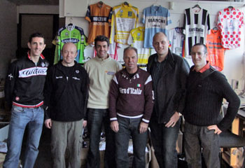
the colourfully named marcin bialoblocki, a veteran of the sports beans team, will again lead the 2010 lineup, managed by ben luckwell, and who will be competing to take themselves even further up the national rankings than 2009's fourth place.
some days you get the mountain...
wilier/bigmaggys/prendas ciclismo cycle team | prendas ciclismo

posted friday 19 february 2010
..........................................................................................................................................................................................................manifestos do not good posters make, atmo. unless...
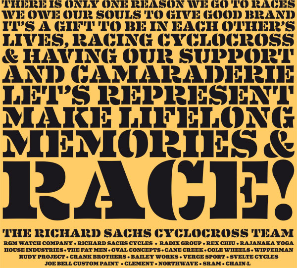
a few weeks back i was attempting to take a photograph of a building from an elevated position, a situation that necessitated a visit to the upstairs office across the road. while making my way to the room with the appropriate view, i passed a closed door with a printed sign taped to it. the lettering used on this white piece of paper was zapf chancery, somewhat of a cliche in design circles, but as if that wasn't bad enough, the text was all in capitals. this is perilously close to a hanging offence. scripts are not designed to be used entirely in uppercase; a capital followed by lowercase is the very least we deserve, though preferably signs should not be printed in zapf chancery in the first place (for the uninitiated, zapf chancery looks remarkably similar to the script used on carbonsports lightweight wheels).
thewashingmachinepost, on most folks' computers, is displayed in a font called georgia. i know that sans serif screen fonts are generally the better option, purely due to the limitations engendered by trying to display serifs at small sizes on today's flat screens as well as crt monitors, however, georgia has been specifically designed to get around this problem, and it looks far more eloquent than arial in my opinion. i have no desire to go into the whys and wherefores of style sheets on web pages, but basically it is only possible to specify fonts that are likely to be installed on readers' systems, and georgia is one of them.
apparently html 5, the next generation of markup language for web developers, will cure this problem by allowing the referencing of fonts installed on the web server, ignoring whether or not the fonts are on users' computers. however, the thought of more html (hyper text markup language) scares me to death; as if everything wasn't complicated enough already.
but typefaces are intrinsically of interest, often creating a greater degree of clarity and atmosphere than the words alone. i like words, i like typefaces (most of them) and i like photos and illustrations. i don't like numbers, and they don't like me; it's a comfortable relationship. typography was one of the subjects i studied closely at college, and while i am a long way from being an expert in the subject, it still fascinates almost as much a bicycles. there are others in the world who have not only a greater degree of expertise in the world of letters, but who design and sell them for a living. and, believe it or not, just such a collection of individuals sponsors a cycle team.
house industries became the company behind the name in the spring of 1994, releasing their first 'themed' collection entitled the bad neighbourhood the following year. their current offerings are often eccentric and idiosyncratic, so it really should come as no surprise that, when allocating sponsorship for the 2009/2010 cyclocross season, the house industries name took pride of place on the front of richard sachs' team jerseys. and with the team's rather fine string of results, the people in da house, were well pleased.
you may recall my screening of the richard sachs team manifesto, where mr sachs instilled the team's raison d'etre to those racing in team colours on sachs frames. it was, to put not too fine a point on it, inspirational, a point of view shared by many of those who read it. next week (feb 26-28), the north american handbuilt show takes over the greater richmond convention center, in richmond, virginia for its annual display of all that is good and great in the world of bicycles, built in more traditional fashion than is the case for your average taiwanese factory. happily it won't just be the bicycles that are handbuilt.
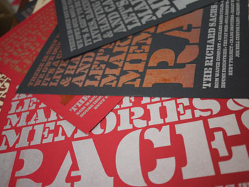
on the 11th of march, house industries will release its latest font collection entitled eames, an example of which can be seen as you entered the page, and again to your left. for those of us who could acceptably be described as fontaholics, this typeface is almost as exciting as the possibility of drooling over a red sachs steel frame in the flesh. and it may not have escaped the attention of many that the text beautifully described above is a subtle contraction of the manifesto that is a central character in this article. so far, so good; but i promised you hand-built.
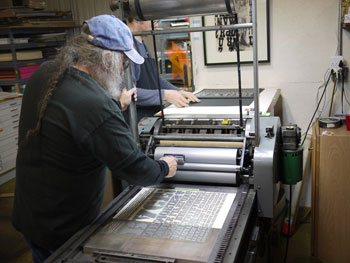
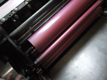
a few days past, ben and rich of house paid a visit to lead graffiti, a print house in newark, delaware to hand print superb versions of the above on a vandercook cylinder press, from a photopolymer plate. the end results will be available for sale on the sachs stand at nahbs in a beautifully symbiotic relationship between racer and sponsor, between bicycle and printing press, between manifesto and typeface.
i love it when a plan comes together. watch the poster being printed here
richard sachs | house industries | lead graffiti | nahbs

posted thursday 18 february 2010
..........................................................................................................................................................................................................who is doing what for whom?

you will, i hope, forgive me for being pretty vacant about who, if anyone, has been sponsoring britain's national bike week over the past few years. i have, on occasion, organised a small event by way of participation: it's the only national concession to cycling as an activity that i am aware of, and while my confidence in the efficacy of the week has yet to rise to exalted proportions, it seems churlish to criticise solely from the outside looking in. i am, undeniably, a cyclist and thus feel honour bound to be a part of it all, and show support for the initiative.
but national bike week doesn't organise itself; there is undoubtedly a massive battalion of salaried and voluntary personnel keeping track of the myriad events either happening or not happening across the country, and doing so takes money. some of that money comes via government departments and smaller commercial sponsors, but overall, the week needs major commercial input to help it achieve the prominence it so rightly figures it deserves. except that, despite being someone involved in writing about cycling, and supposedly reasonably aware of the commercial aspirations of same, i cannot remember who sponsored last year's event.
personally i figure bike week ought to be extended to a month, and do away with all the silly events that are designed to make cycling look as if it's fun (which it is), but which rarely, if ever, have any lasting effect. a month might just mean that the powers that be, however or whoever you feel that description fits, might have to take a more strategic view. and if those powers really want to increase cycling use, one or two incentives wouldn't go amiss. while cycling has its serious side, with activists intent on promoting the use of the bicycle in a more forceful, but peaceful way, i can't help feeling that handing out colourful spoke reflectors and balloons, is not the ideal way to impress upon an apathetic public, the importance of cycling within the grand scheme of things.
but then 2010 happens along, and national bike week has attracted a new sponsor, which i doubt will seriously alter the event's perspective. edf energy have turned the union jack green and used their team green britain to head up the public presence of bike week. apparently 'team green britain aims to inspire the nation to work together and lower the nation's carbon footprint by 2012'. laudable aims no doubt, and we cannot be surprised that a sponsor wishes to impose some order upon those partaking of their goodness.
'by getting on our bikes, we can all play our part by reducing our own carbon footprints while exercising and saving time and money too.'
it does sound rather similar to the platitudes offered by beauty pageant competitors, but it smacks rather heavily of industry wishing to align itself with cycling for its own benefit, while attempting to convince of the contrary. edf energy is part of the edf group, europe's largest, lowest carbon energy producer, and is apparently now britain's largest provider of low carbon electricity. the parent company is french, and not just french, but state owned; so while edf energy is based in london, effectively british national bike week is now being sponsored by the french (edf is an acronym for electricite de france).
granted, the company has given some indication that it is interested in renewable energy, owning one or two windfarms in the uk, as well as a few coal-fired power stations (none of which, incidentally, are anywhere near scotland). but i can't help feeling that there is sleight of hand going on here, and those of us on two wheels, intent on promoting our sport and mode of transport, have become the fall-guys. according to philip darnton, chair of cycling england, "this sponsorship from a high profile brand like edf energy's team green britain, will help further mainstream cycling and recruit more people than ever during bike week". i don't know mr darnton, but he will hopefully excuse my failure to join in the excitement. i doubt very much whether national bike week has had any lasting impact on the number of folks riding bikes in the uk; i figure that many other, more realistic initiatives, are responsible for that.
i can't help thinking that edf are set to gain far more from their association with cycling than cycling is ever going to get from them. that's likely the nature of sponsorship. and i'm enough of a realist to know that bike week in its present form requires substantial capital to continue, and that, to a point, the event cannot afford to pick and choose its sponsors; i'd be surprised if there was a large queue. but i figure that national bike week needs a good shake and a serious re-think; most of my non-cycling colleagues are blissfully unaware of its presence in june of each year. it comes across as an instantly forgettable few days, and even if lip service is paid, it's pretty much forgotten about by the time july hoves into view.
brand new materials including posters, flyers, balloons and stickers are free to order.
yep, that'll do it.

posted wednesday 17 february 2010
..........................................................................................................................................................................................................cool is as cool does. park tool frame fit pump
a matter of days ago (at least it seems that way), i was indulging in a modicum of narcissism by pointing out just how cool i had become, simply through the seemingly innocent act of placing a frame fit pump under the top tube of the cielo. this was not to suggest that the very same pump would not have comfortably occupied the same space under that of the colnago c40, but in the disparaging world in which i live, there's something not politically correct about making this the case on a carbon frame. i'm happy to debate this at length, but here is neither the time nor place. at any rate, as previously mentioned, there's something comfortably continental and aesthetically pleasing about the practicality of such a utlitarian tool affixed to a steel bicycle.
i am not, you may be pleased to hear, desperately trying to gain a few more kilometres out of the same old, same old, because there is a subtle difference in improvement.
the original frame-fit pump was acquired as proof of concept and i was willing to endure a number of idiosyncracies in order to pedal the test-bed for analytical purposes. the pump featured last time was particularly low-cost, and as alluded to in the initial article, actually designed to nestle adjacent to the seat tube rather than under the top tube. i had taken steps to minimise the rattling that our frost-bitten roads engendered on an implement not strictly speaking at home in its enforced awkward position. the change was marginal.
but fundamentally the experimental stage was doomed to a modicum of failure due to the pump being just a smidgeon shorter than was strictly necessary to be squeezed in situ. thus while i truthfully had managed a convincing number of kilometres without so much as a hint that gravity would interfere, the following days' travails were not so kind, and in order to make it home with most of my sanity intact, i had to resort to placing the pump in its natural position, parallel to the seat-tube.
as previously pointed out, doing so not only hides those funky cielo decals, but closes out the possibility of placing a secondary bottle cage on the frame. and we could not be seen to be party to potential dehydration.
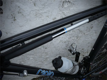
the option was, therefore, either to revert to the common compromise of carrying that blackburn airstick in a back pocket, or search for something more appropriate to the job at hand. thankfully, by placing my self-inflated ego on the interweb drew related correspondence from a post reader, pointing me in the direction of a nifty piece of kit from park tool: the pmp-5. it seems those blue and white people in minneapolis st paul, may have also experienced the difficulty of choosing an appropriately sized pump to fit under the top tubes of their velocipedes. having the ingenuity and workshops in which to fashion the solution certainly helps, but this is the answer to all our dreams.
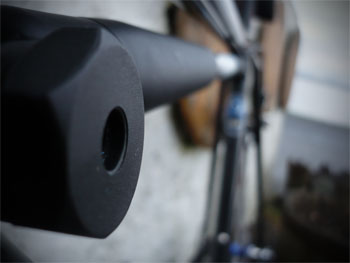
according to the box, the pump will fit in as small a space as 43cm, all the way to 62cm (though the website stops at 56cm), and it does this by means of a slotted pump handle. pull the handle to the desired length, then twist sideways to engage a fitted widget on the aluminium barrel in a series of angled slots on the handle. the pump, rather logically, should be longer than the space it is intended to fill, the act of compression being the force that defies gravity and holds it in place.
in practice, there is very little rattling, even on those less than billiard table smooth roads, and each sculpted end is slightly rubberised, in order not to scratch that diamond like paint scheme. and wouldn't you just know it: the first day out with pump in place, i got a puncture half-way home. the slotted handle opens out in the manner of a t-bar providing extra leverage when attempting to return that skinny tyre to the pressures it has come to know and love.
even with the modicum of impatience on display at the time, i was able to impart 80 psi (5.5 bar) into the replacement tube to rescue the trip home; park describe the maximum input as being 160psi (11 bar), and while i figure i could have managed 100psi (6.9 bar), unless i do a heck of a lot of gym work, i doubt that 160 is going to happen in this decade. 100 i can live with.
it seems churlish to consider the weight of the pmp-5; not that i know what it weighs, but i doubt a) that weight weenies would carry a pump anyway and b) that they'd be riding something as functional as steel. it does cater for both schraeder and presta valves via a removable and flippable rubber insert, should you feel like a walk (pedal) on the dark-side, and the direct-on pump head is kept in place by a lockable pressure lever. this time cool is also eminently practical, though the marketing people at park really ought to put more thought into the name: the dial assist pmp-5. not nearly as snappy as an airstick. cost in the uk is around the £27 mark, while disappointingly it's only around $25 across the pond.
the inequity of being cool, i suppose.

posted tuesday 16 february 2010
..........................................................................................................................................................................................................asleep at the wheel
as robert millar was once quoted as saying 'there's training, and then there's training', and never a truer word was spoken. having not had the need for a training plan of any description, any so-called training in which i have participated, has been gleaned from some of the excellent books that velopress have sent for review. thus, there is every possibility that my piecemeal approach has had more flaws than benefits (because i tend to incorporate the bits that i like, rather than the stuff i need), but gave me the necessary bragging rights in the office of a monday morning, and a series of ever increasing numbers on the occasional garmin. nowadays i adhere religiously to advice given by chris distefano: 'start slow and taper off'.
as i intend to live until the grand old age of 180, i have a good few decades to go yet before i reach middle-age, but already, any thoughts of being competitive have been shelved in a safe place (and if put there by mrs washingmachinepost, then there's not a chance they will ever be recovered), and i am enjoying my travels across the outer edge on the cielo; as long as i can still get to the top of the hill before the mighty dave t, then all is well with the world.
however, i do not identify as your average cyclist. if the articles featured weekly in the comic, and monthly in c+ are anything to go by, and i would find it hard to believe that both do not understand their target market, then thousands of you have training requirements that need to be constantly fed, enhanced, upgraded, downloaded and taped to the handlebar stem. so perhaps the post's substantial readership simply hangs out here for a momentary respite, before once more digging in: no pain, no gain. yes, i'm aware that things are a might more scientific nowadays, but the only part of this scientific approach that i generally hear from those engrossed in its minutiae, concerns the hill reps, fartlek, base mileage, strength training, heart rates and power output.
but as i understand the human physiology from the point of view of an innocent bystander, is that in order to progress with these efforts, a certain amount of rest must be added into the equation. in fact, a heck of a lot of rest. yet, while there are dvds, and thousands upon thousands of words covering the active part of cycle training, i can honestly say that the only rest of which i have been aware is as a part of recuperation from injury. i do not readily recollect reading chapters on how, when and precisely why this rest should be shoe-horned into the grit and determination. because it's not just rest, as in sitting in the armchair with a copy of the comic on your knee, or dropping in at deb's for a soya cappuccino and a browse through the house copy of the comic. everybody does that sort of thing.
so just as getting the miles in has devolved from its premier status in the training panoply in favour of quality, not quantity, the very same criteria should, apparently, be applied to rest and sleep. aha, sleep, that word that describes just how you'd likely feel after knocking off another five hours before breakfast; how hard can that be? the majority of washingmachinepost articles are handcrafted to a length that has them finish just as the reader begins to nod off. with one or two exceptions, all of us can fall asleep, especially while at work, so it turns the system on its head to look at it as part of work rather than necessarily as a reaction to it. and i can assure you that i'm not the first to take notice of this.
january was the month of team launches: sky, rapha and endura that i'm specifically aware of, and it's the last of those three that have taken interesting steps to improve on their 2009 season. aside from being kitted out in the new endura equipe range of clothing, developed, i'm led to believe with input from last year's team, the endura racing squad will be working during 2010 with the porsche human endurance centre at silverstone. more regularly working with motor racing drivers, the centre's director, andy blow said; 'the chance to help support endura with impartial fitness assessments and heat acclimation training (we have a heat chamber in the lab) is beneficial for php, raising our profile in the media and the chance for us to work with elite performers outside of motor racing. rob hayles is a big believer in the scientific support side of coaching, and was very keen on the relationship. we hope to progress this as we get to know the riders and team, offering them a flexible level of support to optimise training and helping the riders peak at the right part of the season.'

the porsche human performance centre employs a number of highly qualified sports personnel along with state-of-the-art facilities to enable any customer, whether they be an entire team such as endura, or the well-heeled individual, to make greater strides towards excellence than would perhaps be the case otherwise. nowadays it's all about those last few seconds or kilometres per hour. but digression has returned us to the act of pummelling that body in an attempt to better its physical properties. i thought we were about to talk about the nice part of training where we can all get some sleep.
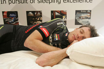
well, i perhaps haven't gone as off-topic as you may have at first thought, because we are still, at the moment, concerned with the endura racing team. in addition to forging the relationship with porsche (so to speak), they're going to get some more sleep, but this time, with professional help. nick littlehales is sleepathlete, a company that not only provides the sportingly enhanced with advice on how to get a good night's worth, but has available a substantial range of sleep recovery products designed to do what it says on the box. or carry bag.
team manager/rider, rob hayles, needs little introduction to the possibilities: "sleep is a massive part of cycling. for me it's a third of the overall package, along with your nutrition and your training, so it's a big part of my strategy and hopefully it will be a big leap forward for the team as a whole." you see, a professional racing team tends to move about a bit; something to do with races not being in the same place all the time. so while you and i can strip off those sweat-soaked shorts, jersey and baselayer at the end of giving ourselves a hard time and head upstairs to that lovely comfy bed, many a rider has little idea what sleeping arrangements await at the end of the day.
nick littlehales has over 25 years experience of sleep (nice work if you can get it), having worked with some of the premier division's top football teams (i just know there's a joke in there somewhere), but became involved with cycling when helen wyman started to take a more than askance glance at her sleep recovery. "at the time, she was travelling quite a bit to cyclocross races in various parts of the world, and started to become aware that her sleep patterns were anything but regular. we were able to help look at the possibilities. the services of sleepathlete have been capitalised on by a whole host of mainstream sports looking for the edge over the competition."

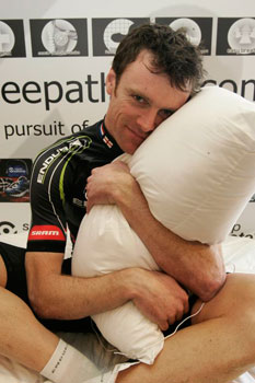
having mentioned that sleepathete has a not inconsiderable range of sleeping recovery products, as a special treat for the endura racing team, riders were supplied with sleepathlete pro-sound pillows which feature an ipod connection, designed to help them develop a sleeping and relaxation routine on the move. i cannot claim to have much in the way of difficulty geting to sleep at night, given that i usually need a rest after changing channel on the tv, but it's nice to have the opportunity to live just a tiny part of the life of an athlete, even if it is only the bit where you get to sleep like a log. i say this because nick was kind enough to send a pro-sound pillow to washingmachinepost cottage just in case i was tired.
the pillow comes in its own carry-case, having been designed as a regular accompaniment to the competitive athlete no matter where he/she might find themselves after a bout of training or, perchance, racing. i am, if little else, a bit of a sceptic when it comes to this sort of thing; generally i'd be of the opinion that a pillow, is a pillow, is a pillow, and plonking your head on anything soft, white and fluffy of a darkened night is all that any honed athlete requires. the pro-sound rather blew that pre-conception out of the water on night one. i have never, in my entire life, laid my head upon such a fabulous example of sleep inducing softness; but it doesn't stop there.
while disappearing into the land of nod has, as i have previously related, not been that much of a problem, if wakened during slumber, it's sometimes difficult to re-enter fuzzy-time, and for this i absolutely adore this pillow. the advent of the ipod has meant that, providing i remembered to take the darned thing upstairs in the first place, plugging in a pair of headphones can aid sleepy-time. but it's very uncomfortable lying on an ear filled with headphone, an inconvenience alleviated by the existence of a small speaker built into the pillow, connected to a lengthy cable and plug. the speaker causes no discomfort at all, and is quiet enough not to disturb a soundly sleeping mrs washingmachinepost.
nick recommends fifteen minutes of music, sound (apparently white noise is very good) or speech, and no more. the desired effect is that the displaced athlete can take a little bit of home or audio comfort with them wherever in the world they may find themselves. it's this that aids the sleep recovery process. i love it, and i'm at home, so i can only imagine the benefit when other than where you might like to be.
so it's not just down to getting a bit of a rest after velocipedinal exertion; there is a bit of science and consideration involved, and should your regime dictate that a closer look is warranted, sleepathlete and its attendant products would seem the intelligent place to start.
the pro-sound pillow sells for £24.90 and comes complete with removable ipod cable attachment, internal speaker, and arrives in its own carry bag.
sleepathlete | porsche human performance centre | endura
posted monday 15 february 2010
..........................................................................................................................................................................................................