
..........................................................................................................................................................................................................
rouleur photography annual 2008 - rapha publishing, 304pp £37
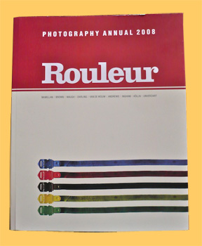
this review was originally posted on saturday 11th october, but has now been updated with two photographs reproduced from the annual
last year, rouleur produced their first photographic annual initially in a signed limited edition, hardback format, followed by an unsigned version, then lastly in softback, generally to high critical acclaim. and rightly so; if you are a rouleur aficionado, the opportunity to settle down of an evening with such an attractive volume on your knee, was very hard to resist. but while rouleur has continued to delight its many fans throughout this past year, is the annual release of more of the same, in softcover only, the sort of project that bears repetition?
hell, yes!
it is a testament to the photographers involved that almost all of them are working at the cutting edge of their vocation; effectively, on our behalf, the acceptable avant garde of the photography world are hell bent on producing art that can be appreciated on so many levels. this standard of photography is rarely surpassed in any current field of photographic venture. it is eminently possible that the rouleur annual 2008 could seriously be presented as a textbook for bona fide photography students. commentator phil ligget points out in his foreword...
'as can so often be the case, the difference between being brilliant and boring is just five hundredths of a second away.'
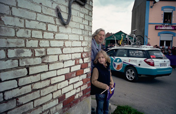
however, as cyclists, we must pretend to be too mundane in outlook to appreciate the contents on such an artistic level - we want cyclists, bicycles, racing, character, crowds. they're all there, and all there in bucketloads. if you've been having a hard time persuading better halves, work colleagues, or the man in the street just how passionate and exciting the sport of cycling really is, you have now been provided with 304 pages of propaganda.
this beautifully printed volume contains a wide range of observations by camille mcmillan, gerard brown, geoff waugh, taz darling, rein van de wouw, guy andrews (who knew he was this good a photographer?), ben ingham, tim kolln and olaf unverzart, each section arranged in the similar order to the cycling season, beginning with dengie (no, me neither - buy the book and find out) and etoile de besseges, through the classics, the major tours and finishing with a highly interesting selection of spectres by olaf unverzart. selected sections are accompanied by text from some of cycling's finest writers, including rouleur editor guy andrews, matt seaton, will fotheringham, herbie sykes and several others.
there will doubtless be annuals from others in the world of cycling, particularly as we head towards christmas, but at the risk of being accused of either favouritism or pre-judgement, they will be hard pushed to supplant this as one of the finest photographic testaments to the 2008 cycling season that money can buy.
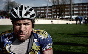
the rouleur photography annual 2008 is available from rouleur.cc for £37 including uk postage. if you're across the pond or of an international flavour, contact rapha via their website for pricing.
photos copyright ben ingham and taz darling - reproduced with permission
posted on saturday 11th october photos updated 15 october
.........................................................................................................................................................................................................embrocation magazine - volume two
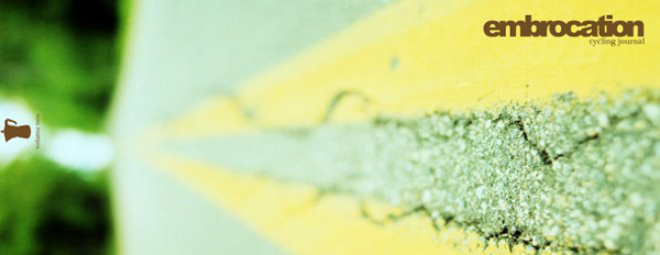
you know how members of parliament, and for all i know, american senators, have to declare any commercial interests that may prejudice their views or voting principles on specific issues? well, before i start filling pixels with stuff about embrocation magazine, i feel it only right and proper that i too, declare an interest. volume two includes a contribution from yours truly entitled king of the mountains which, you will not at all be surprised to hear, is about robert millar. and the pages even have red polka dots. i am a happy bunny.
however, it doesn't quite stop there. if you have a look at the illustration above - it's the embrocation cover - the photograph was taken by my good friend, daniel wakefield pasley, he of rapha continental fame. in fact, daniel also accompanied editor jeremy dunn to taliah lempert's studio in brooklyn and took the photographs to go with taliah's interview. and if you've read the post for a year or so, you'll know that taliah's paintings are a favourite at washingmachinepost towers. so you can see that i have a large amount of interest to declare, all of which you need bear in mind when i tell you that it's one of those must have publications; sort of the modern equivalent of a 'zine'.
there are features on the frame builders of the north american handbuilt show, lots of slightly off the wall stuff labelled *atmo and a couple of pages of polaroids which are worth exploring for people that some of you might know (see if you can spot the other chris and the genius that designs rouleur.)
if you trawl the cycling blogs, and i'm pretty sure that most of you do, you can't help but notice that one of the more popular blogs in the world, aside from bikesnobnyc, is belgium kneewarmers in conjunction with which rapha have just issued a pair of white (really) kneewarmers bearing the belgian colours down the front of the shin. embrocation has taken the interesteing step of reproducing a few of the postings from this website in print format (seems david carson was wrong).
the writing's good, the design is idiosyncratic, the photography is generally pretty cool, and apart from having printed part of taliah's interview twice, it's very well worth getting hold of a copy. you can order via the embrocation website or blog for a mere $19 (around a tenner) plus postage.
isn't cycling wonderful?
*atmo = according to my opinion - a trademark of richard sachs, he of the quite superb handmade bicycle frames
posted on tuesday 14th october
.........................................................................................................................................................................................................going round in circles

many years ago, when cycling was previously seen as great, kelloggs breakfast cereals not only had sponsored the tour of britain, but reached deep into their pockets and benevolence to sponsor a series of what i think the americans would call crits: cycling round a variety of uk city centres. these races were very popular, providing a competitive series of events for the home professionals and amateurs as well as the opportunity to fly in one or two international stars. the great robert millar even took part in one of the crits north of the border.
these events were all televised and shown by the new kid on the block (at the time) channel four, who, it has to be said, had kick started much of the interest through their daily tour coverage in july. of course, as with everything apart from acres of wall to wall football coverage, all good things tend to come to an end, and once the televisual experience was relegated to some bizarre times of the night/early morning, interest waned and the series died off.but now that britain is in love with cycling yet again (when was the last time you saw a cyclist in a fashion shoot in one of the sunday supplements?), the time is ripe to have another go. enter the tour series, a ten round city centre cycling series which will take place in may and june of 2009. organised by sweetspot with able assistance from anthony mccrossan's cyclevox, negotiations are currently underway with sky tv and itv (please let it be the latter - i don't have skysports, and i really don't want to pay them any more money) to televise beginning, middle and end. while the final itinerary is yet to be completed, locations currently under discussion are darlington, derby, exeter, milton keynes, southport, stoke on trent, woking and york.
the format should be relatively simple - the events are not based on individual efforts, but on team effort and the majority of entrants in the 2009 series will be british professional teams - ten teams of five riders - with special guest stars appearing at many of the tour series events. the teams are allowed to change their line-up from one event to the next, and the races will be held on tuesday and thursday evenings.
the more astute scotsmen amongst you will have picked up on the fact that there are no towns north of the border included in the current list. i asked brian smith about this, and while there will be no scottish events run as a part of the tour series, they are currently looking at a mini series of scottish events or a couple of nocturnes. and i should ruddy well think so too.so hopefully, cycling will move from being flavour of the month and extend its grasp over the british psyche, then we can all look forward to the length and breadth of the country being as cycling friendly as portland, oregon
posted on monday 13th october
.........................................................................................................................................................................................................rapha blue winter bib tights
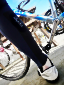
it's a long running conversation of consternation that ranks up there with the perennial campagnolo v shimano debate and should i shave my legs or not. just one false move in this department could have far reaching implications for a cyclist's career; arranged in the wrong way amongst the wrong crowd and you could be a domestique until you make your lance armstrong comeback.
should you wear your socks over the top of your bib tights, or under?
oh, yes, you may scoff, snigger or even laugh out loud, but if tom boonen knocked on your front door right this minute and asked you that question, would you have the confidence to blurt out the correct answer? because, as far as i'm concerned, i'm not sure that there is a correct answer. look at it this way: at the foot (pardon the pun) of each leg of a well made pair of bib tights is a shiny ring of gloop to make sure that the legs don't ride up as you ride out. if the tights weren't meant to be under those merino socks, then what's the point of the gloop, since it seems to have less than a tangible grip on most of the socks in my collection. but then why, if we observe the tautological follow on from this observation, is it that those in the v c d'ardbeg peloton who should probably know better, feel compelled to point out an unknowing fashion faux pas?
much like the campag/shimano debate, this is likely to run for ever, but in the short term, it really doesn't help the hapless tester (me). are you all observing the patiently taken photographs that accompany this review, and thinking to yourselves that's just plain wrong/right (delete as applicable)? this may be a debate to which we can return at a future date; perhaps i could just ask the manufacturers which option they were designing for.
meantime, having digressed just about as much as usual, and having placed the tights over the socks, how come i'm testing a pair of tights that currently feature not on rapha's web pages? well, around this time last year, rapha issued their first pair of roubaix backed bib tights in ford model t black with a distinctive white panel on the back of the left leg. such distinction was hard to miss, even in an unruly peloton. i have a pair of these very close to the top of the cycle clothing pile at the moment, since the approaching winter temperatures generally recommend the covering of shaved legs (another debate settled).
however, if you cast your mind back to two major teams from the early nineties - wordperfect and buckler - their team colours were principally blue, and both rode colnagos. inspired by same, rapha have laterally shifted from common or garden black for much of their 2008/09 winter range, so this year's roubaix bib tights are also available in blue; the panel on the back of the left leg is black, with a shiny black printed rapha logo. such subtlety is impressive. fortunately, that is not the only impressive part of such lower limb apparel.
the stretchy, stretchy fabric employed in these, is backed with thermo roubaix, and i'm sure i have no need to inform you of my liking for cosy. some tights come with comfy bits, and some without; these are the latter, exactly the same as last years. you'll need to employ that favourite pair of bib shorts to keep your bum happy. i, similarly to many others, own pairs of bib-tights with and without comfy bits, and i'm not sure i can come down in favour of one or the other. in what is rapidly becoming a rapha trademark, these fit so well that it's easy to forget they're there. the bibs are constructed from a particularly fine mesh, as are their bib shorts, so wearing one pair on top of the other gives no rise to discomfort over the shoulders or chest, on or off the bike.
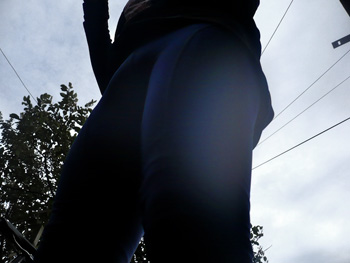
as i have doubtless pointed out on more than one occasion, we have weather over here: saturday was cold with heavy showers, sunday was just plain cold.
and windy.
while i spent some interesting minutes trying to decipher why a garmin 705 was intent on guiding me to abbotsinch airport (several hundred kilometres east), an operation which turned out to be entirely pilot error, my finely sculpted thighs and calves were warmly protected from the elements. the fit, build and rapha styling really has to be appreciated on the bike in the cold, into a headwind. if they work here, a couple of laps of richmond park will be a walk in the park.
you get the idea.
at the base of the bib section on the rear, there is a hidden zipped mesh pocket (presumably for the race radio?) and continuing the affinity with tim krabbe's the rider, the word wheelsucker is clearcoated on the bum. if you can read it, you probably are. £140 ($250) may seem rather a lot to spend on a pair of bib tights which lack a comfy pad, but if you manage to get your legs into a pair of these, all will become clear - very much the luxury end of the market. my information from rapha indicates that these will also be available in the more traditional black/white combination at the same price point, but real men will wear blue.
edwig van hooydonck did.
rapha's winter bib tights should be available from 20th october. | rapha.cc
posted on sunday 12th october
.........................................................................................................................................................................................................the cycle show, earls court, october 2008
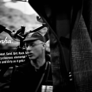
in the 1860s, a loose association of french artists, including monet, cezanne, manet, pissarro, degas, and several others, began exhibiting under the moniker the impressionists, taking their title from a work by claude monet - impression, sunrise. characteristics of their work - so called impressionist painting - included visible brush strokes, an emphasis on the ever-changing light, but most importantly the effect of the latter on the human perception of movement. basically what was being described by way of paint and line was the artists' impression of the world about them, and their emotional and artistic reaction to same. this was very much at odds with classical painting and drawing, which concerned itself solely with a concrete and impassioned description of its subject matter.
so thewashingmachinepost visit to the earls court cycle show on thursday 9th october adhered more closely to the former than the latter; partly through a healthy disregard for any organisational abilities, but more importantly to an ad hoc affinity with chatting to everyone and anyone who showed the faintest proclivity for same. having arrived on a warm, sunny morning off the sleeper from glasgow central, jez hastings and i walked from euston to earls court via hyde park and commenced surveillance activities at just after the opening time of 10am. unfortunately (well, for the purposes of this article), come 12:30, we had only managed to get ourselves from the colnago stand (see colnago.cc) to the rapha stand; not a particularly good score by anyone's standard.
sadly, we didn't really get that much better. the afternoon wore on, in time honoured fashion, and the talking simply never ceased. brilliant. the worst part was that we really rather enjoyed chatting with all the folks we met - some hopefully have become new friends,
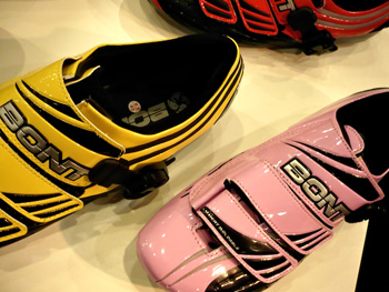 others we've known for ages. it's certainly an important part of networking within the industry, of which i have no trouble kidding on that the post is a part, but it meant that any new and important developments arriving on the cycle scene were probably missed entirely. to those who put soul, effort and large amounts of money into promoting their wares to the press, and trade, i apologise unreservedly. i think next year, two trade days may well be to all our advantage. the only folks we managed to miss completely, despite a thorough search of the sales floor and a phone call, were mick and andy of prendas ciclismo: an opportunity missed.
there were some items/stands that we deliberately avoided altogether; as defenders of the campagnolo faith, both jez and i resolutely avoided making any attempt whatsoever, to try out shimano's di2 electronic groupset. many have tested it already, even in shimano's homeland, so we simply deferred. and we didn't stand about to watch the balancing of mountain bikes on the edges of things put there for that very purpose: eddy didn't need to do that, so we didn't need to watch; that, and we're boring old farts anyway.
all this chatting is undoubtedly of assistance to the well oiled running of
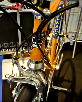 thewashingmachinepost anyway (as i have managed to convince myself). the earls court cycle show is predominantly a consumer led show, hence the existence of a retail zone which was all but empty on trade day, but many of the folks responsible for plying me with information anad goodies throughout the year were in attendance, and it seems entirely respectable to contact said persons if only to thank them for such unbridled assistance in the past, and to perhaps arrange for more of the same as time goes by. not being one much into name dropping for the sake of doing so, i shall refrain from ignoring the credo at this point, but simply to say that it took place.
by the time you read this, it will probably be too late to pay a visit yourself, but if i were you, i'd block off a day in october next year and make the effort to attend; there are a lot of very nice shiny bikes and components on display, some of which you can actually lift, poke or even ride. the so-called consumer days feature a number of well known cyclists and cycling personalities, usually being interviewed by anthony mccrossan, should you feel the need to have a break from wandering round looking at lots of stuff of which your bank manager would heartily disapprove. i'd imagine that the biggest difference between you going to earls court, and jez and i doing the same, is time: we arrived at 10:10 and left at 18:00. such selfless devotion to duty.
however, it ended not there; by uncanny co-incidence, we were invited to two apres show parties, both of which we were keen to attend. initially this seemed like it was
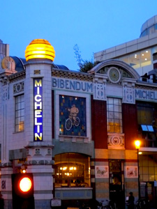 unlikely to happen, considering the rather extraordinary size of the city of london in comparison to our usual abode. how the heck were two guys from islay going to figure the logistics of attending two completely separate parties in london? however, if proof were ever required of the existence of karma, the london-paris party was almost directly opposite , meaning we could easily spend an equal amount of time at each. and we did - how cool was that? and i met ben ingham for the first time.
very many thanks to sven, jane and moira at l2p and all at rapha for their wonderful hospitality; it made the homeward journey much more bearable than anything scotrail caledonian sleepers could manage.
much of the discussion and idle chat will bear fruit in thewashingmachinepost over the next few months - you'll just have to guess if that's how it happened or not.
posted on saturday 11th october
.........................................................................................................................................................................................................campagnolo raytech jersey & bib tights
colours are quite fascinating; adobe systems host a fascinating website called kuler which allows (principally) web designers to pop along and use kuler themes provided by others or, for the more adventurous, to create your own colour themes. as time and commerce trundle along, it will suprise you not to know that the mighty adobe (owners of my beloved photoshop) have begun to integrate the technology into their software products so that the highly adept amongst us (nobody of that description here) can make a better stab at mixing and matching. of course, with such tools freely available to all and sundry, it was only a matter of time before cross (pun intended) fertilisation occured.
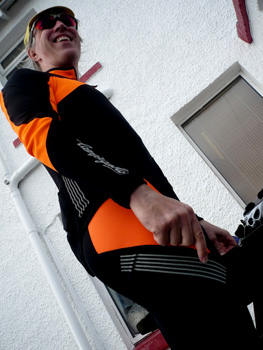
the giro leader's jersey notwithstanding, the kuler pink has entered and taken a firm hold of the cycling psyche, as indeed have black and white, and latterly lime green. (have you seen jez's bob jackson fixie?) so now, here we are within one testing week (or so) and items of cycling apparel have arrived from two quite distinctly different purveyors, both brandishing the kuler orange as their badge of honour. i have previously tested rapha's cross range of jersey and bib threequarters who bore perhaps more affinity to the kuler philosophy; the orange was married with a rather tasteful brown in the jersey while hiding its light under a subtle bushel.the two items under consideration here, however, are in headlight orange, by which i mean it is used more as the identification you'd need if you ever had to ditch in the sea and required a rescue helicopter (something that just could actually happen over here). this is not by way of criticism; cyclists need all the brash identification they can lay their track mitts on these days, and it might as well be by way of a kuler that hints at style along with its neon blaze. the jacket is incredibly well thought out: the orange portions are positioned on the underside of the arms and when on the hoods or drops these shine out to approaches from behind. that the orange is married with black and strategically placed reflective stripes (re*light) provides the ultimate contrast. safe and sound.
this is also the first jacket on which i have observed the sleeves being fashioned in a way similar to some kneewarmers. great thought and technique has been employed in keeping any seams well away from the elbow bend, both inner and outer. while it does have a touch of the reebok panels for panel's sake about it initially, observed in practice it's really darned clever, soft and comfortable.
kuler aside, the jacket fits damn well. unlike my previous encounter with camagnolo, the sleeves are of a length that provides great joy, as well as reflective campagnolo logos on each forearm. if you've got it - flaunt it. such brand detailing stretches to the winged logo just below the collar between the shoulders, as well as engraved on a good, solid zip pull front and centre, as well as on the fourth, zipped pocket on the back. orange is also featured on the high collar; the textran jacket is from the campagnolo winter 08 range, so a snug neck is well nigh obligatory.
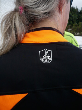
if a complaint should consider rearing its ugly head, it's that the rear pockets seem a mite high on the back. either that or my arm flexibility is diminishing.
the bib tights match the jacket, if not in surface texture, definitely in kuler scheme. there are large, brash orange flashes on each side panel; very enhancing for those finely honed thigh muscles. heading towards the ankle, panel mayhem abounds, and strangely i found it quite difficult to keep one of the angled seams away from behind the knee joint. fortuitously, the pedalling action achieved no discomfort. since the bib tights are intended to be, and, indeed, are a close fit, these leave intriguing engravings on each leg when removed.
each leg has an ankle zip, forming a tight closure without any resultant contortions when removing same from body. inside, there are some nice fleecy bits, always just where needed, and in keeping with the winter categorisation, the rear of the bib section comes all the way up to the shoulders. while i can sympathize with those of you, like me, who struggle to get a handle on just how different companies size their leg garments, i have a fairly small waist, so the pair tested were size small. the inside leg on said pair is 31" meaning that the campagnolo branded gloop on the inner ankle grasped on just the point intended. the fit is very good.
there are two types of bib tight: those with pad, and those without. happily, these had a comfy bit, sometimes more comfortable than wearing shorts and tights. campagnolo's bib tights sport the patented airpropad which looks sort of similar to everything else you've ever seen, except for two mini landing pads in the bum seating area. this is a small, foam-filled space station sandwiched within the pad itself. in practice comfort reigned supreme. i can't honestly say it was miles more comfortable than anything else i've ever sat on, but it's up there with the very best. the version fitted to the test pair was of the long distance variety, so i'm really trying my best to fulfil their promise.
you can read my waxing lyrical about the past and present joys of pure natural wool, but that's not to say that modern fabrics and build techniques don't have their place in even the amateur peloton. if orange and black are not in your kuler portfolio, there are alternatives which you local campagnolo sportswear dealer would be more than happy to show you. very fine apparel from the modern day spinal tap successors and worthy of a place in the modern day cyclist's kuler co-ordinated wardrobe. unless you ride shimano, of course
the textran jacket retails at around £80 ($140) and the bib tights at £100 ($173). many thanks to uk campagnolo clothing distributor, jim walker for supplying the clothing in this test.
posted on tuesday 7th october
.........................................................................................................................................................................................................woolistic merino training jersey
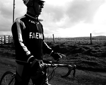
if you ignore all the modern technical fabrics, with all their promised benefits to mankind, some of which are eminently true, some of which exist only in the mind of the marketing guy who wrote the copy, you are left with what? well, before lycra and polyester there was wool; all our heroes from the start of the twentieth century, right up to the early seventies were clad in wool jerseys, with any necessary logos either embroidered, or sewn onto the wool itself. screen-printing had most certainly been invented by then, but it's a brave designer/manufacturer who would have tried to screen print onto wool. dye sublimation was the sort of phrase you would have expected to hear along with klaatu barada nikto on the day the earth stood still or perhaps something that scottie needed dilithium crystals for in early episodes of star trek.
and despite all the advances made with wicking fabrics, with carbon and silver woven into anything the self-respecting cyclist might consider wearing, there really is little to compare with good old fashioned wool. yes, place too much in those rear pockets and you could find the jersey dragging on the back wheel, and stay out in the rain too long and the weight of rider and bike could almost double, to say little of the melting of any sartorial elegance that once existed. and when it came time to train for those important, early season classics, it was on with yet another exploit of those merino sheep - this one with long sleeves and no pockets - to while away the merry hours on the bicycle with your team mates, a headband and a lead car.
sometimes nostalgia is all its cracked up to be.
since i never race; well unless you count several attempts trying to beat brian smith to the top of a few french hills, it must be considered that i am perpetually training. and if this is indeed the case, then it is only right and proper that i find myself suitably attired for the occasion, even if that occasion is every time i go out on the bike. yes, i have myself a wardrobe full of three-pocketed jerseys of varying hue and of particular aptitude for the process. and do i not, therefore, qualify for a training jersey, one designed expressly for wear on the bike? a resounding yes was almost heard.
and so it has come to pass. a company rightly renowned as providers of the finest merino wool cycling attire - woolistic - have provided a substantial and highly sought after training jersey, that i might train in the rapidly cooling climes that are a feature (not a bug) of scotland's western hebrides. a jersey that can all but negate those carefully chosen lightweight components, allowing it to fulfil its primary function of cosiness in the saddle. in extreme opposition to such a a polti or le groupement jersey, the woolistic faema training jersey manages the equivalent of monochrome: black and white. never was such luxury so beautifully understated; with faema logos front and back, added white stripes on sleeves and shoulders, and white/black hoops on collar and cuffs.
while i don't get out much, i am painfully aware that jerseys such as this are more regularly worn as apres peloton attire, not out of place at debbie's cafe or similar establishment - heck, faema made coffee machines, so realistically, how appropriate can one be? however, while the merest hint of a complaint regarding the wearing of same in such a relaxed manner would hardly be entertained, just how good is one of these on the bike in the cold, into a headwind? after all, it says training on the label, and i think we've established that, for me at least this is an end in itself, rather than the more usual means to an end.
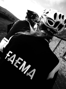
so, to make a long story considerably longer than it likely needs to be, it was into the great wide yonder, wearing the more usual sartorial suspects on a sunday morning ride (which, believe it or not, extended to around 75km) covered with the faema training jersey. i just love wool; not only did it turn out to be a lot more windproof than had been expected, but cosy, cosy, cosy. out by islay's atlantic coast to watch the waves pound into the headwind that will be our companion for the next few months. by february, even our shadows will be fit.
bizarrely, considering our location in october, it didn't rain (though it more than made up for this on the previous day), so i can tell you nothing as to the jersey's behaviour under precipitative conditions. and i'm quite happy about that. faema looks very much at home in front of a double espresso; brown and black and white. this may be a jersey you specifically buy for leisure wear, and the added unique selling point of that logo (let's face it - it's on a need to know basis). there are other designs in the range, as well as a series of replica short sleeve cycle jerseys also available - a veritable plethora of stylish merino, and more than practical for what it's really meant for.
and did i mention that it was cosy?
woolistic jerseys are designed in switzerland and available from vintagevelos.com. the faema training jersey as tested currently retails at $195 (£110) (reduced from $225 - £130). their superb range of team jerseys retail at prices starting from $138/$148 (£80/£85) (short/long sleeve), as well as a full range of merino products including custom design.
posted on monday 6th october
.........................................................................................................................................................................................................solo maxwell cycles jersey
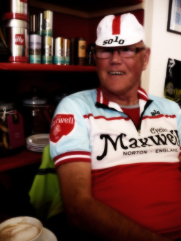
as you are probably tired of hearing, every year, solo cycle clothing of auckland, new zealand, host a readers' poll on their website to choose which nationality will benefit from an appropriate jersey in the coming season. granted, their season doesn't quite match the european season, because they're upside down and back to front. this means that the latest piece of apparel has arrived in short sleeve format just as it gets a lot (and i mean a lot) colder in the northern hemisphere. ok, so they've also popped in a new mapp long sleeve training jerseys to their portfolio, but i'm sure you get the general idea. the winning nationality for 2008 was england, and while we're a very tolerant peloton in velo club d'ardbeg - two scots, and two english - if i'd worn a jersey bearing an english rose on the sleeve at the braveheart ride this month, brian smith would have had my guts for garters.
so the obvious choice for the test and review of a jersey bearing the legend maxwell cycles, norton england, was the mighty dave t, something that paul at solo was happy to live with. worn stylishly and as gracefully as befits a directeur sportif, the mighty dave penned the following words, while the photos were taken at our preferred hostelry after a 75km sunday ride.
having spent many years now living here on the isle of islay, surrounded by pale, blue skinned people with ginger hair, shouting "freedom!" (i jest), it was nice to receive a stunning garment from the other side of the planet, namely New Zealand, and from people who speak the same language!
the said garment arrived very smartly packaged; the jersey itself is very well made, beautifully and sharply coloured, and simply screams class. amongst the three rear pockets, it includes a very useful zipped coin compartment, and even boasts the seven letter word england neatly emblazoned for all to see.
the fabric used in the jersey's manufacture is sportxdry which, it is claimed, will wick away the sweat from your body. at the time of writing, there's a bit of a blow on outside, so I have been unable to test this claim, but I believe every word paul and his band of artisans say (they wouldn't lie to the mighty dave t, would they?).
i will, without doubt be posing for a photo shoot at debbie's coffee stop at the weekend (which, as you can see, did indeed come to pass). may i suggest that every mature english cyclist purchase one, and do the same at their local café stop. they could even use some of their winter fuel payment, as long as they don't tell the government!
there really can be no higher praise than this. either pop into mosquito bikes in london, or click through to the solo website to avail yourself of a maxwell cycles jersey.
dave t says do it now before you forget.
the solo maxwell cycles jersey retails at £63 ($125) in sizes from xs to xl.
paul informs me that november this year will see the next online poll for a 2009 national jersey, and it had better be scotland this time. prime your voting muscles now.
posted on sunday 5th october
..........................................................................................................................................................................................................